In summary:
- True spatial flow comes from architectural strategy, not just decorative tricks like mirrors or light paint.
- Analyze structural boundaries first; identifying non-load-bearing walls is a critical first step for any major layout change.
- Master “furniture physics” by pulling pieces away from walls to create defined, functional pathways and zones.
- Use perceptual psychology—consistent colors and flooring—to reduce the brain’s “cognitive load” and make spaces feel larger.
- Consider a “broken plan” with subtle dividers to gain functional zones without sacrificing the feeling of openness.
For many apartment dwellers in the 600-900 square foot range, the core frustration isn’t a lack of style, but a lack of flow. You feel it every day: the awkward shuffle around a sofa corner, the dead end in the living area, the visual chaos of a layout that feels choppy and disconnected. The conventional wisdom offers a familiar chorus of advice: add mirrors, paint everything white, and declutter. While helpful, these are merely surface-level fixes to a deeper, structural problem.
As a space-planning architect, I see this differently. The issue isn’t just about what’s in your space, but the very physics and psychology of the space itself. A home with poor flow suffers from high “threshold friction”—subtle barriers that interrupt movement and sightlines, making the brain work harder to navigate. This creates a constant, low-level stress and makes a home feel smaller and less functional than its square footage suggests. True optimization isn’t about hiding clutter; it’s about conducting a form of spatial choreography.
But what if the key wasn’t just adding reflective surfaces, but strategically removing visual and physical barriers? What if creating flow was less about decoration and more about understanding how to manipulate walls, furniture, and color to guide the eye and the body? This guide moves beyond the platitudes to give you an architect’s perspective on reclaiming your space. We will deconstruct the elements that create blockages and explore the structural and perceptual strategies to design an open, intuitive home.
This article will guide you through the key architectural considerations for creating seamless flow. From assessing your home’s structural bones to leveraging the psychology of color and materials, you’ll gain a strategic framework for transforming your compact apartment. The following sections break down each critical step in this process.
Summary: How to Optimize Home Interiors for Open Flow in Small Spaces
- How to Identify Non-Load Bearing Walls Without a Contractor?
- Open Plan vs Broken Plan: Which Fits a Family of Four Better?
- The Furniture Placement Error That Wastes 20% of Your Floor Space
- When to Knock Down Walls: The Best Season for Dusty Renovations
- Why Does Poor Flow Reduce Property Value by Up to 15%?
- Why Does Eliminating Color Breaks Trick the Brain?
- How to Transition Flooring Materials to Mark Kitchen Boundaries?
- How Do Monochrome Palettes Make Small Apartments Feel 30% Larger?
How to Identify Non-Load Bearing Walls Without a Contractor?
Before dreaming of a vast, open-plan space, you must confront the physical reality of your home’s structure. The most significant barrier to flow is often an internal wall, but not all walls are created equal. Load-bearing walls are integral to your home’s structural integrity, supporting the weight of the floor or roof above. Non-load-bearing (or partition) walls, however, serve only to divide space. Removing the wrong one can be catastrophic, so accurate identification is the non-negotiable first step in any major renovation. While a structural engineer provides the only definitive answer, you can perform a preliminary investigation to understand the possibilities.
This initial assessment involves playing detective in your own home. The goal is to gather clues from your attic, basement, and the walls themselves. A key technique is the “top-down, bottom-up” investigation, where you check for corresponding support structures both above and below the wall in question. If floor joists in the attic run perpendicular to and rest upon the wall, it is almost certainly load-bearing. Likewise, if the wall is directly supported by a beam or foundation wall in the basement or crawlspace, it is performing a structural role. An absence of these connections strongly suggests it’s a simple partition wall.
Your Action Plan: 5-Step DIY Wall Identification Checklist
- Review Structural Drawings: If available, check original blueprints. They explicitly show which walls are designated as load-bearing and map out the entire structural system.
- Check Attic and Basement: Look for beams, posts, or joists that rest directly on the wall. If floor joists run perpendicular to the wall, consider it load-bearing until proven otherwise.
- Use a Stud Finder: Locate the internal supports. While not definitive, the presence of continuous, heavy-duty structural materials can be an indicator of a load-bearing function.
- Observe Wall Thickness: Load-bearing walls are generally thicker than partition walls, often constructed with 2×6 studs instead of the standard 2x4s to handle the increased load.
- Know When to Call a Pro: If you find complex wiring, plumbing, HVAC ducts, hidden beams, or if the wall runs parallel and directly under a single joist, stop immediately and consult a structural engineer.
Open Plan vs Broken Plan: Which Fits a Family of Four Better?
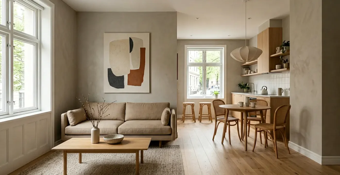
The dream of an open-plan layout—a single, expansive space for living, dining, and cooking—has dominated home design for decades. It promises light, social connection, and an enhanced sense of space. However, for a family of four navigating the realities of remote work, homework, and relaxation, a completely open area can become a zone of sensory overload. The noise from the TV bleeds into a work call, and cooking smells permeate the entire floor. This has given rise to the “broken plan,” a more nuanced approach that offers a compelling alternative. Interestingly, homeowner preferences are nearly split, with 51.2% favoring open concepts and 48.8% preferring traditional, divided layouts.
The broken-plan philosophy acknowledges that a modern family home must serve multiple functions simultaneously. It’s a workspace, a school, and a sanctuary. Instead of removing all walls, this approach uses subtle, strategic partitions to create distinct zones without sacrificing visual connection. This could involve half-walls, glass partitions, slatted wood screens, or even large furniture like bookshelves. The primary benefit is acoustic zoning, which mitigates noise and allows varied activities to coexist harmoniously. A parent can take a Zoom call in a semi-enclosed nook while children play in the main living area, maintaining a sense of togetherness without the chaos.
This method enhances the feeling of a well-designed home where every activity has its designated place, reducing clutter and stress.
As shown in the image, strategic dividers like low shelving or screen panels can create functional separation while maintaining an open feel. The result is a home that supports the complex dynamics of family life, offering both shared space and pockets of privacy. It’s the architectural equivalent of having your cake and eating it too: the spaciousness of an open plan with the functionality of a traditional one.
The Furniture Placement Error That Wastes 20% of Your Floor Space
One of the most common and costly mistakes in interior layout is what I call “Wall-Hugging Syndrome.” It’s the intuitive but incorrect impulse to push every piece of furniture—sofas, chairs, cabinets—flush against the walls. The thinking is that this will maximize the open space in the center of the room. In reality, it does the opposite. It creates a dead, unused “racetrack” of empty floor in the middle and makes the room feel static and poorly planned. More importantly, it fails to define functional zones and create the clear, intuitive pathways that are the essence of good flow. This single error can make a room feel cramped and shrink its usable area significantly.
The solution lies in mastering “furniture physics” and embracing the concept of floating your furniture. By pulling pieces even just a few inches away from the walls, you allow the space to “breathe.” This creates visual separation and establishes clear circulation paths. A critical rule of thumb is to maintain at least 30-36 inches of walkway for major traffic routes, ensuring effortless movement. For seating areas, arranging furniture in a conversational group, with pieces no more than 8-10 feet apart, creates a human-centric zone that feels intentional and inviting. This is the foundation of spatial choreography: using objects to guide movement and define purpose.
Adopting this principle transforms a room from a simple container for things into a dynamic, functional environment. Here are the core rules to follow:
- Pull Furniture Away from Walls: Even 3-6 inches makes a difference. For larger pieces like sofas, consider “floating” them in the room to anchor a seating area and create pathways behind them.
- Create a Conversation Arc: Arrange seating to facilitate interaction, ideally within an 8-10 foot diameter. This naturally forms a functional zone separate from the room’s perimeter.
- Maintain Clear Traffic Paths: Ensure major walkways are at least 30-36 inches wide. This prevents bottlenecks and makes navigating the space feel effortless.
- Embrace Negative Space: A room doesn’t need to be filled from wall to wall. Empty space is a crucial design element that helps the layout feel intentional and uncluttered.
When to Knock Down Walls: The Best Season for Dusty Renovations
Once you’ve decided to take the plunge and remove a non-load-bearing wall, a crucial logistical question arises: when should you schedule the work? The process is inherently disruptive, generating significant dust and noise. The timing can impact everything from contractor availability and cost to your own comfort during the project. Many homeowners default to summer, assuming the long days and good weather are ideal. However, this is often a mistake. Summer is peak renovation season, meaning contractors are in high demand, and their prices may reflect that.
From a strategic standpoint, autumn is often the renovation sweet spot. The weather is typically mild and dry, which is perfect for a dusty project. You can keep windows open for natural ventilation to manage airborne particles without letting in oppressive heat or freezing cold. Furthermore, because it’s past the summer rush, contractors are generally not yet at their busiest, potentially leading to better availability and more competitive pricing as they look to fill their schedules before winter. This timing also allows you to complete the project and enjoy your newly opened space during the holiday season.
As the image suggests, the ability to ventilate your home naturally is a significant advantage of an autumn renovation. Fine dust from drywall and demolition can linger for weeks, and constant airflow is the most effective way to clear it out. Planning your project for the fall aligns practicality with financial savvy, creating the optimal conditions for a smoother, more comfortable, and potentially more affordable renovation experience.
Why Does Poor Flow Reduce Property Value by Up to 15%?
The concept of “flow” can feel abstract, but its impact on a home’s financial value is very real. While the 15% figure in the title represents a potential upper limit for homes with severely dysfunctional layouts, the underlying principle is sound. A home with poor flow—characterized by awkward pathways, cramped rooms, and a disconnected layout—suffers from what appraisers and designers call a “functionality discount.” Potential buyers experience this the moment they walk in. They may not have the architectural vocabulary to describe it, but they feel it as a sense of confusion, confinement, or frustration. This negative first impression immediately lowers their perception of the property’s worth.
A space that “just works” feels more valuable because it supports the buyer’s imagined lifestyle without compromise. Clear sightlines make a home feel larger and more welcoming, while intuitive pathways mean a buyer doesn’t have to mentally rearrange furniture to make the space livable. This is why well-executed open-plan designs can be so valuable. According to the National Association of Home Builders, a thoughtful layout can have a direct positive impact on a home’s market appeal. As they noted in a study on buyer preferences:
Open floor plans can increase home value by 5-10% in suburban markets.
– National Association of Home Builders, Floor Plan Preferences Study
This value increase is the flip side of the functionality discount. A home with excellent spatial choreography doesn’t require a buyer to “think twice” about how they would live in it. The layout feels natural and supportive, which translates directly into a higher perceived value and a willingness to pay a premium. Investing in flow is not just an aesthetic upgrade; it’s a direct investment in your property’s equity.
Why Does Eliminating Color Breaks Trick the Brain?
One of the most powerful tools for increasing the perceived size of a small apartment has nothing to do with knocking down walls. It’s about manipulating perception by eliminating visual breaks. When your eye scans a room and encounters an abrupt change in color—for example, from a white wall to a dark “accent wall”—it registers a boundary. Your brain processes this as an edge or a corner, effectively stopping the perceived space at that line. By using a consistent color palette across walls, trim, and even ceilings, you remove these visual stop signs. The eye travels uninterrupted, and the brain interprets the entire volume as one continuous, larger entity. This is the Cognitive Load Theory of Spatial Perception in action.
Reducing the number of visual boundaries simplifies the information your brain has to process. Instead of calculating the dimensions of multiple small, color-blocked sections, it perceives one unified volume. This creates a sense of continuity and expansiveness. As interior design experts from MyMove point out, consistency is paramount for creating this effect. They advise that key features should be visually linked:
Maintaining an aesthetic flow throughout an open-concept living space is paramount. Fundamental design features such as flooring and recessed lighting should be consistent. Color palettes in different spaces should complement one another.
– MyMove Interior Design Experts, Modern Open Floor Plan Design Guide
This doesn’t mean your entire apartment must be stark white. The principle works with any color, as long as it’s applied consistently to create long, unbroken sightlines. The goal is to create a seamless visual envelope that allows the perceptual volume of the space to feel much larger than its physical dimensions. By minimizing visual interruptions, you’re essentially tricking the brain into seeing more space than is actually there.
How to Transition Flooring Materials to Mark Kitchen Boundaries?
In an open-plan or broken-plan home, defining the kitchen area is crucial for both function and safety. While you want visual continuity, you also need a clear boundary that signals a shift from a relaxation zone to a work zone. Flooring is the most effective tool for this, but a simple, straight transition strip can feel abrupt and create “threshold friction.” The key is to create a transition that feels both intentional and seamlessly integrated into the overall design. Advanced techniques move beyond a basic line on the floor to become a deliberate design statement.
One of the most sophisticated methods is the seamless inlay, where one material is custom-cut to fit precisely into another. Imagine hexagonal kitchen tiles set perfectly into the edge of a hardwood living room floor, creating a fluid, organic boundary. Another powerful strategy is “Waterfall Logic,” which uses the kitchen island as the natural dividing line. The flooring material changes precisely at the island’s edge, anchoring the transition to a major architectural element and making the boundary feel logical and crisp. For a more dynamic effect, a diagonal cut between two materials can guide traffic flow and create a custom look that feels more energetic than a standard perpendicular line.
A further consideration is the psychology of the materials themselves. Using a visually “hard” and durable material like tile or polished concrete in the high-traffic, functional kitchen zone, and transitioning to a visually “softer” material like wood or luxury vinyl tile (LVT) in the living area, creates a subconscious shift. It tells your brain you are moving from a task-oriented space to a space for comfort and relaxation. This is a core principle of broken-plan design: using materials to create distinct zones that support different activities without building restrictive walls.
Key Takeaways
- Flow is an Architectural Strategy: True flow is achieved by designing intuitive pathways and sightlines, not just through decoration.
- Analyze Before You Act: Always determine if a wall is load-bearing before considering removal. This is the most critical safety and structural check.
- Use Furniture as a Tool: Float furniture away from walls to create “furniture physics” that define zones and guide movement, reclaiming wasted space.
- Leverage Perceptual Psychology: Use continuous color and flooring to reduce cognitive load and make spaces feel significantly larger than their physical dimensions.
How Do Monochrome Palettes Make Small Apartments Feel 30% Larger?
While the “30% larger” claim is a powerful metaphor, the expansive effect of a monochrome palette is a real phenomenon rooted in the physics of light and the psychology of perception. A monochrome scheme—one built on various tones, shades, and tints of a single color—creates an unbroken visual field. Whether you choose charcoal, navy, or classic beige, this continuity is key. As noted in an analysis of open-plan interiors, this principle holds true even with dark colors when light is managed well, as a monochrome palette reflects light more evenly across surfaces. This even reflection minimizes the harsh shadows that often define corners and edges, which visually break up a space and make it feel cramped.
The secret to a successful monochrome design is not bland uniformity, but rich texture. To avoid a flat, boring room, you must express the single color through a multitude of materials: a chunky wool throw, velvet cushions, a linen curtain, a smooth metal lamp. This layering of textures creates depth and visual interest without introducing color clutter. It allows the eye to appreciate the subtle variations within the chosen hue, making the space feel sophisticated and complex, not empty.
Furthermore, you can enhance the effect with an advanced technique known as “atmospheric perspective.” This involves using slightly lighter shades of your chosen color on the farthest walls of a room. Just as distant mountains appear paler and bluer, this trick makes those walls appear to recede, artificially enhancing the perceived depth of the space. It’s a subtle but powerful way to expand the perceptual volume of your apartment, proving that a well-executed monochrome scheme is one of the most effective architectural tools for small-space living.
Ultimately, creating a sense of open flow is a masterclass in spatial choreography. It requires moving beyond simple decoration and adopting an architect’s mindset—viewing your home as a system of volumes, pathways, and sightlines. By strategically addressing structural boundaries, mastering the physics of furniture placement, and leveraging the psychology of perception, you can transform a cramped, choppy apartment into a space that feels expansive, intuitive, and perfectly attuned to your life. Begin today by applying these principles to create a home that not only looks larger but truly lives larger.