Contrary to popular belief, a statement piece’s success isn’t about its boldness, but the strictness of the rules you apply around it.
- Scale is calculated, not felt. It relies on mathematical ratios and precise measurements for pathways and visual weight.
- A non-negotiable visual hierarchy—one hero, a few supporting actors, and a neutral background—is the only way to prevent aesthetic chaos.
Recommendation: Treat your room as a system to be engineered for impact, not a canvas to be randomly filled. Control is the new creativity.
You’ve found it: the perfect armchair, a magnificent canvas, or a sofa with audacious lines. You bring it home, place it in the room, and step back to admire your masterstroke. But instead of elevating the space, it shatters it. The room feels smaller, cluttered, and chaotic. This is the common paradox faced by design lovers who dare to go bold. The piece you loved in isolation has become a tyrant in your home, dominating every sightline and creating visual noise.
The standard advice—”make it a focal point,” “build the room around it”—is frustratingly vague. It treats interior design as an intuitive art, a matter of feeling. But when dealing with a powerful statement piece, intuition is a liability. Relying on “what feels right” is how you end up with a room that feels fundamentally wrong. The key to success isn’t found in more inspiration, but in more discipline. It requires a shift in mindset: from decorator to director, from artist to architect.
But what if the secret wasn’t about finding “balance,” but about enforcing control? What if anchoring a room was less an art and more a science, governed by specific, measurable rules? The true mastery of a statement piece lies not in its selection, but in the rigorous application of principles that manage its power. It’s about calculating scale, defining a strict visual hierarchy, and weaponizing negative space to give your hero piece the stage it deserves, without letting it upstage the entire production.
This guide provides the non-negotiable rules for integrating a single, powerful object into a cohesive whole. We will dissect the mechanics of scale, the psychology of visual hierarchy, and the strategic use of light and space, providing a blueprint for turning a potentially overwhelming object into your room’s greatest asset.
Table of Contents: A Rulebook for Dominating Your Decor
- How to Calculate the Perfect Scale for a Statement Sofa in a 12×12 Room?
- The “Museum Syndrome” Risk: Having Too Many Hero Pieces
- Sculptural Chair vs Large Canvas: Which Anchor Defines the Room Best?
- How to Light a Statement Armchair for Dramatic Evening Impact?
- Why Does the Eye Need Negative Space Around Bold Objects?
- Oversized vs Undersized: Which Scale Error Ruins Room Proportions?
- The “Power of One”: When to Display a Single Object in Isolation
- How to Use Statement Lighting to Replace Art in Minimalist Homes?
How to Calculate the Perfect Scale for a Statement Sofa in a 12×12 Room?
In a precisely defined space like a 12×12 foot room (144 sq ft), there is no room for error or “eyeballing” scale. Choosing a statement sofa based on feeling is the fastest path to a cramped, unusable space. The correct approach is not creative, but mathematical. It begins with the foundational 60/40 rule: your furniture’s total footprint should occupy no more than 60% of the room’s floor space, leaving a mandatory 40% as negative space for circulation and visual breathing room.
Within this envelope, circulation is non-negotiable. You must maintain a minimum of 18 inches for any major pathway. The relationship between the sofa and its coffee table is equally rigid: the distance between them must be between 18 and 36 inches to allow for both comfortable passage and functional reach. Anything less is a design failure. Furthermore, the coffee table itself must be approximately two-thirds the length of the sofa to maintain a harmonious proportional relationship.
Finally, consider the sofa’s volumetric impact, not just its footprint. A leggy sofa with an open bottom has a lower visual weight than a heavy, skirted model of identical dimensions. In a room with standard 8-foot ceilings, furniture height should be kept under 30 inches to avoid a top-heavy, oppressive feeling. This isn’t just theory; the vertical dimension has a powerful psychological effect on our perception of space. Choosing the right scale is a calculation, not a guess.
The “Museum Syndrome” Risk: Having Too Many Hero Pieces
The “Museum Syndrome” is a critical design affliction where a room contains multiple, competing statement pieces. In an attempt to showcase several beautiful objects, the designer inadvertently creates a battle for visual attention. The result is not a gallery but a cacophony. No single piece can be appreciated because the eye has no clear place to land, darting from one “hero” to the next in a state of perpetual distraction. As the design editors at Homes and Gardens state with authority:
no room needs more than one statement piece at a time – introduce more and that fabulous focal point will battle for attention and its impact will be lessened
– Homes and Gardens Design Editorial, Homes and Gardens – The Statement Piece Guide
This chaos violates the most fundamental principle of high-impact design: a clear and decisive visual hierarchy. A successful room operates like a well-structured organization. It has one CEO (the primary focal point), a few key executives (secondary accents), and a team of supporting staff (the neutral background). Without this structure, there is no leadership, no direction, and the overall message is lost.
To diagnose and cure Museum Syndrome, you must conduct a ruthless audit of your room’s visual assets. This is not a subjective exercise. It requires classifying every significant object according to its role. If you stand at the entrance to your room and cannot immediately identify the single, undisputed “hero,” you have a problem of hierarchy. The solution is editing—demoting or removing competing pieces until one star remains.
The Hierarchy Audit: A 5-Point Plan to Restore Order
- Identify the Primary (The Hero): Choose the single, dominant element that will command the room. This could be your statement sofa, a dramatic piece of art, or an architectural feature like a fireplace. This choice is final.
- Designate Secondary (Supporting Actors): Select one or two smaller pieces that complement the hero’s color, material, or form without competing. A pair of accent chairs or a distinctive floor lamp could serve this role.
- Assess Tertiary (The Scenery): Everything else in the room must fall into this category. Neutral, textural elements like rugs, curtains, and wall colors should provide a quiet, restful backdrop that allows the hero to shine.
- Enforce the Rule of Three (Maximum): In most rooms, limit your focal points to a maximum of three (one primary, two secondary). In smaller spaces, this number drops to a strict maximum of two.
- Test the Entry Point: Stand at the main entrance. Do your eyes land immediately on the hero piece? If they wander or feel pulled in multiple directions, your hierarchy is still weak. Re-evaluate and edit again until the path of vision is clear and undisputed.
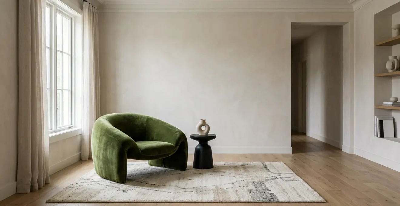
Sculptural Chair vs Large Canvas: Which Anchor Defines the Room Best?
The choice between a three-dimensional object like a sculptural chair and a two-dimensional surface like a large canvas is not a matter of preference. It is a strategic decision between two fundamentally different types of anchoring: functional anchoring and contemplative anchoring. A sculptural chair is a functional anchor; its primary role, beyond its beauty, is to invite physical interaction and structure human behavior. It creates a destination—a place to sit, read, or converse—and actively directs traffic flow around it.
This type of anchor has a powerful volumetric impact. As a 3D form, it carves into the room’s volume, interacting with light and shadow in a complex way that changes throughout the day. It actively alters the shape of the negative space around it, making it an ideal choice for rooms that need a defined purpose or a pivot point for social interaction.
A large canvas, by contrast, is a contemplative anchor. Its function is to direct the gaze and establish the room’s mood, narrative, and color palette. It is a passive influencer on furniture arrangement but a dominant force on the room’s emotional tone. While it adds immense visual interest, its 2D nature keeps the room’s perceived volume intact. It works best on large, uninterrupted walls where it can command attention without physically obstructing the space. The following table codifies the decision-making process.
| Criteria | Sculptural Statement Chair | Large Canvas/Artwork |
|---|---|---|
| Anchoring Type | Functional Anchor | Contemplative Anchor |
| Primary Function | Invites physical interaction; structures how room is used (reading nook, conversation pivot) | Sets mood and tells story; structures theme and color palette |
| Impact on Room Flow | Actively directs human behavior and traffic patterns; creates destination point | Directs gaze and sets tone; passive effect on furniture arrangement |
| Social Dynamics | Creates conversation focal point; people naturally gravitate toward it | Provides visual talking point but doesn’t alter seating arrangements |
| Dimensionality | 3D sculptural form carves into room volume; interacts with light/shadow complexly; alters negative space shape | 2D surface adds color/narrative; keeps room’s perceived volume intact |
| Best For | Small to medium rooms needing functional focal point; spaces prioritizing interaction | Large walls needing visual interest; rooms with established furniture layouts |
| Flexibility | Can be repositioned to change room dynamics | Fixed once hung; requires wall commitment |
How to Light a Statement Armchair for Dramatic Evening Impact?
Lighting a statement piece is not about illumination; it is about sculpting with light. A single, generic overhead light is an act of design malpractice that flattens form and erases drama. To give a sculptural armchair the presence it deserves, especially in the evening, you must employ a layered, directional lighting system. The goal is to reveal its form, highlight its texture, and create a captivating interplay of light and shadow. The professional standard is a variation of the three-point lighting system used in photography and theater.
First is the Key Light, your primary source. This should be a focused floor lamp or a directional spotlight positioned at a 15-45 degree angle to one side of the chair. It is the brightest light and is responsible for creating the primary shadows that define the chair’s shape. A warm 2700K tone enhances the richness of leather or fabric, while a cooler 4000K can accentuate the clean lines of a more geometric piece.
Next, the Fill Light softens the harsh shadows created by the key light without eliminating them entirely. Placed on the opposite side of the chair, this source should be dimmer—about 50-75% of the key light’s intensity. It can be an existing ambient light or a small table lamp with a diffused shade. Its job is to maintain dimension and prevent parts of the chair from disappearing into total darkness.
Finally, the Back Light (or Rim Light) is what creates separation and drama. A small uplight placed behind the chair, aimed at its back or the wall behind it, creates a subtle glowing outline. This effect, known as a silhouette or rim light, visually pulls the chair away from the background, giving it a distinct, three-dimensional presence. For maximum control and mood-setting capability, it is imperative that all three light sources are connected to dimmer switches. This allows you to fine-tune the intensity of each layer, transforming the chair from a functional seat to a dramatic sculpture at will.
Why Does the Eye Need Negative Space Around Bold Objects?
Negative space is not emptiness. It is an active and essential design element—the silent partner that gives a statement piece its power. The human brain is wired to seek patterns and process visual information. When a space is filled with objects, colors, and textures—even beautiful ones—it creates a high cognitive load. The eye and brain are forced to work overtime to decipher the scene, leading to a feeling of subtle stress and visual fatigue. Negative space is the antidote. It is a deliberate, strategic pause.
By surrounding a bold object with a generous amount of “un-designed” area—a clean wall, an empty floor, an unadorned surface—you are doing two things. First, you are drastically reducing the cognitive load on the viewer. The eye is given a clear place to rest, which has a calming, centering effect. This isn’t just an aesthetic preference; giving the eye a place to rest is not merely an aesthetic choice; research shows that negative space creates a calmer environment which can lead to measurably decreased cortisol levels, the body’s primary stress hormone.
Second, you are amplifying the importance of the statement piece itself. By removing all visual competition, you are effectively placing the object on a pedestal. The negative space acts as a frame, drawing the eye directly to the “positive space” of the object and holding it there. Its color appears more vibrant, its form more sculptural, and its material more tactile because it is not fighting for attention. Without sufficient negative space, a statement piece is merely another object in a cluttered room. With it, the piece is elevated to the status of art.
Oversized vs Undersized: Which Scale Error Ruins Room Proportions?
While both oversized and undersized pieces disrupt a room’s harmony, one error is far more destructive to the overall composition. An oversized piece can feel imposing or dominant, but an undersized piece creates something far worse: visual confusion and fragmentation. A too-small object, particularly an anchor piece like a rug or sofa, fails to ground the space. It makes the surrounding furniture appear to be floating aimlessly, creating a disjointed and indecisive atmosphere that makes inhabitants feel unsettled.
This phenomenon is often called the “Timid Dollhouse Effect,” where the scale is so mismatched that it makes the room feel like a poorly executed miniature. An oversized piece might be a bold, if slightly misguided, statement. An undersized piece is a whisper that gets lost, taking the room’s coherence with it.
Case Study: The Timid Dollhouse Effect vs. Proper Anchoring
A design blogger documented her own 12×12 living room transformation where she initially placed a 5×8 rug. The undersized rug, as described in her rookie mistake analysis, created the ‘Timid Dollhouse Effect’—making the room feel indecisive, cluttered with floating furniture, and visually fragmented. After replacing it with a properly scaled 9×12 rug that allowed the front legs of all seating to rest on its surface, the room was instantly transformed. It felt more cohesive, intentional, and paradoxically, larger. The case illustrates that undersized pieces often do more damage because they create visual confusion and make inhabitants feel out of scale with their environment.
Correcting these errors requires different strategies. An undersized piece can sometimes be salvaged by grouping it with other objects (e.g., pairing a small chair with a floor lamp and a large plant) to create a single, larger visual mass. An oversized piece can be mitigated by using a monochromatic color scheme around it, helping it visually recede into the walls. However, the cardinal rule is prevention: always use painter’s tape to mark out the footprint of a potential purchase on your floor. Live with this taped outline for at least 24 hours to assess its real-world impact on flow and proportion before committing.
The “Power of One”: When to Display a Single Object in Isolation
The “Power of One” is the most audacious and disciplined move in a designer’s playbook. It involves displaying a single, exceptional object in deliberate isolation, using the surrounding negative space as the primary design element. This is not minimalism for its own sake; it is a calculated strategy to bestow an object with maximum gravitas. However, this technique is not universally applicable. It should only be deployed under a strict set of conditions.
First, the object itself must be worthy of veneration. It must possess exceptional sculptural quality, profound material richness, or a unique, compelling form. A standard piece of furniture, no matter how well-made, will not suffice. The object must be able to stand on its own as a piece of art, capable of holding a viewer’s attention without any supporting context. Think of an iconic Eames Lounge Chair, a complex sculptural floor lamp, or a single, ancient pottery piece.
Second, the architectural context must support the move. The Power of One thrives in spaces with strong architectural character: high ceilings, large windows, clean lines, or interesting wall textures. The surrounding architecture becomes part of the composition, a silent frame for the solitary object. In a generic, boxy room, this strategy can fall flat, making the object look less like a revered icon and more like a piece of furniture waiting for its companions to arrive.
Third, the intended purpose of the space must align with tranquility and contemplation. This technique is perfectly suited for an entryway, a quiet library, or the end of a long hallway—spaces designed for passage or pause. It is generally unsuitable for high-energy, social spaces like a family living room or a bustling kitchen, where the demand for function and comfort would make such stark minimalism feel impractical and unwelcoming. The Power of One is a declaration that in this specific zone, aesthetics and form take precedence over all else.
Key Takeaways
- Scale is mathematical, not emotional. Use the 60/40 rule for floor space and maintain a minimum of 18 inches for circulation paths.
- Enforce a strict visual hierarchy. Every room needs one undisputed hero piece, a few supporting actors, and a quiet, neutral background.
- Negative space is an active tool. It is the silent frame, the cognitive pause that reduces visual clutter and gives your statement piece its power.
How to Use Statement Lighting to Replace Art in Minimalist Homes?
In a minimalist interior where the goal is to eliminate superfluous objects, traditional artwork can feel like a concession. The ultimate expression of minimalism is to make the essential elements do the decorative work. Here, lighting transcends its utilitarian function and becomes the art itself. This can be achieved through two distinct philosophical approaches: “Light as Sculpture” or “Light as Paint.”
The Light as Sculpture approach treats the light fixture itself as the primary art piece. This involves selecting a dramatic, sculptural pendant, chandelier, or floor lamp whose physical form is compelling even when the light is off. It serves as a tangible focal point, replacing the need for a painting or sculpture on a nearby wall. The Light as Paint approach is more ethereal. It uses discreet, often hidden fixtures—wall grazers, recessed uplights, or projectors—to “paint” surfaces with light, shadow, and texture. Here, the light itself, and its interaction with the architecture, becomes the artwork.
The following table breaks down these two strategies, providing a clear framework for deciding which approach suits your space and design philosophy.
| Approach | Light as Sculpture | Light as Paint |
|---|---|---|
| Definition | The fixture itself is the art piece | Discreet fixtures used to ‘paint’ walls with light, shadow, and texture |
| Example Fixtures | Sculptural pendants (Bocci, Lindsey Adelman), dramatic chandeliers, artistic floor lamps with bold forms | Wall grazers, linear LED strips, projectors, recessed uplights |
| Visual Impact | Immediate, tangible focal point even when lights are off | Invisible during day; dramatic reveal at night |
| Best Room Type | Living rooms, dining rooms, entryways with high ceilings | Hallways, textured brick/concrete walls, minimalist bedrooms |
| Design Philosophy | Statement object replaces need for artwork | Light itself becomes the artwork through interaction with architecture |
| Dynamic Capability | Static sculpture; same visual presence always | Highly dynamic with smart systems (Casambi, Hue); changes throughout day |
| Installation Complexity | Moderate (standard ceiling mount or plug-in) | Higher (often requires electrician for wall washing or custom placement) |
Case Study: Dynamic Art with Programmable Ambiance
A Brooklyn loft conversion, detailed on a professional lighting blog, eliminated all traditional artwork in favor of a programmable lighting system. Using smart bulbs and wall-washing LED strips, the homeowner programmed distinct ‘scenes’: a cool 5000K wash for energizing mornings, a neutral 3500K with subtle shadows for the afternoon, and a warm 2700K with dramatic uplighting that transformed a textured brick wall into a golden, shadowed canvas in the evening. The result was a living, breathing artwork that changed its personality throughout the day, providing far more visual interest than static paintings while maintaining a rigorously minimalist aesthetic.
Now, stop admiring and start measuring. Assess your space, choose your single hero, and apply these rules with precision. The cohesive, high-impact room you envision is not a matter of chance, but of deliberate, disciplined control.