Abstract Expressionism is more than art; it’s a strategic tool for emotional engineering in homes that feel too sterile.
- Color Field paintings can introduce profound calm into high-traffic areas.
- Gestural works inject vital energy that can be balanced with minimalist decor.
- The historical DNA of the movement makes it inherently modern, not dated.
Recommendation: Instead of choosing art to match your sofa, select a piece that evokes a desired feeling, and let it guide the emotional calibration of your space.
For many homeowners, the dream of a clean, minimalist interior can curdle into a sterile, impersonal reality. The very simplicity that promises calm can leave a space feeling cold and lacking a soul. In the search for a solution, many turn to conventional advice: add a “pop of color” or find a “statement piece.” While well-intentioned, this approach treats art as mere decoration, an afterthought to fill a blank wall. It overlooks the profound psychological power embedded within certain art forms, particularly the revolutionary canvases of Abstract Expressionism.
Born in post-war New York, this movement was never about creating pretty pictures. It was a radical break from tradition, an attempt to channel raw, unfiltered emotion directly onto the canvas. This is its historical DNA. The energy of Jackson Pollock’s drips, the contemplative depth of Mark Rothko’s color fields—these are not just aesthetic choices; they are records of human feeling. This article rejects the notion of art as simple decor. Instead, it positions Abstract Expressionism as a functional design tool for what can be called emotional engineering.
But if this art is so powerful, how can a homeowner wield it without creating chaos or making a space feel dated? The key lies not in just picking what you love, but in understanding how different facets of the movement—from its scale and composition to its inherent energy—create a visual dialogue with a modern interior. We will explore how to strategically deploy these works not just to beautify a room, but to actively shape its atmosphere, transforming a cold minimalist box into a dynamic, emotionally resonant home.
This guide provides a framework for understanding and applying these principles. We will deconstruct the specific ways different types of abstract art interact with a room’s function and layout, offering a new perspective on creating truly personal spaces.
Summary: Why Does Abstract Expressionism Remain Crucial for Modern Emotional Interiors?
- Why Do Color Field Paintings Calm High-Traffic Living Areas?
- How to Balance Gestural Abstraction With Minimalist Furniture?
- Action Painting vs Geometric Abstraction: Which Suits a Home Office?
- The Clashing Mistake: Mixing Busy Patterns With Abstract Art
- When to Add a Statement Canvas to a Neutral Room Scheme?
- Symmetry vs Asymmetry: Which Layout Promotes Better Focus?
- The “Granny Chic” Risk: Losing Your Modern Edge With Vintage
- Which Contemporary Paintings Add Depth to Flat Walls Without Cluttering?
Why Do Color Field Paintings Calm High-Traffic Living Areas?
High-traffic areas like living rooms or entryways are often saturated with activity and visual noise. The common impulse is to keep walls bare to avoid adding to the chaos. However, this is where Color Field painting, a sub-genre of Abstract Expressionism, offers a powerful, counter-intuitive solution. Pioneered by artists like Mark Rothko and Helen Frankenthaler, these works are characterized by large, solid expanses of a single, unified color. They lack a central focus, a defined subject, or energetic brushwork, inviting the eye to wander without landing anywhere specific.
This “all-over” composition is key to its calming effect. Instead of demanding attention, a Color Field painting provides an immersive experience. It acts as a meditative portal, absorbing the room’s frantic energy and offering a moment of pure, uninterrupted chromatic sensation. As artist Hans Hofmann noted, color itself stimulates moods. The vastness of a deep blue or the soft glow of a muted ochre can fundamentally alter a room’s psychological temperature. Indeed, research on color psychology shows that hues like soft greens and blues can reduce eye strain and foster a sense of tranquility, making them ideal for spaces where we seek refuge from the day’s overstimulation.
The goal is not to “decorate” the wall but to change its very nature—from a hard boundary to a soft, atmospheric plane. By choosing a large-scale Color Field work, you are not adding another object to a busy room; you are infusing it with an antidote of profound, quiet contemplation. This is emotional engineering at its most subtle and effective.
How to Balance Gestural Abstraction With Minimalist Furniture?
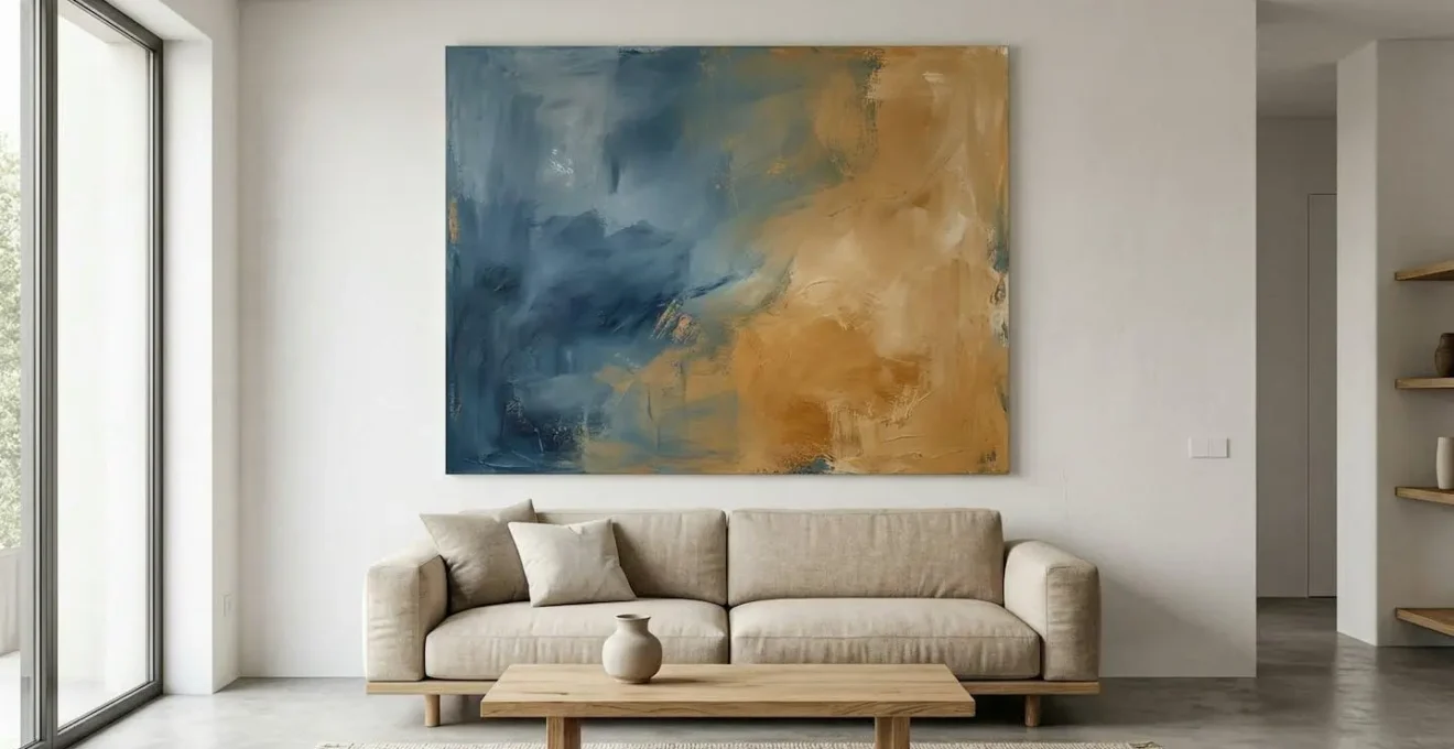
If Color Field paintings offer a whisper, Gestural Abstraction delivers a shout. Works by artists like Willem de Kooning or Jackson Pollock are defined by their dynamic, energetic brushstrokes, drips, and splatters. They are records of physical action and raw emotion. Placing such a potent piece in a minimalist interior can feel like a contradiction—the chaos of the canvas versus the clean lines of the furniture. Yet, this very tension, when managed correctly, creates a space that is both exciting and sophisticated.
The secret is to create a visual dialogue rather than a competition. The minimalist furniture provides the essential “negative space” or quiet structure that allows the painting’s energy to breathe without overwhelming the room. Think of the furniture as the solid, grounding bassline and the artwork as the complex, expressive melody. One supports the other. This balance is not just about color, but about texture. The smooth, clean surface of a modern console or the simple weave of a neutral sofa creates a tactile contrast with the thick impasto or layered chaos of the painting.
As this image demonstrates, the juxtaposition of textures is where the magic happens. The raw energy of the paint is elevated by the refinement of the furniture, and the minimalist piece is saved from sterility by the artwork’s vibrant personality. To achieve this harmony, allow the painting to be the undisputed focal point. Keep surrounding elements simple and subordinate. Let the artwork’s palette inform one or two accent colors in the room—a cushion, a vase—to create a thread of connection, but resist the urge to match everything. This creates a balanced environment that feels alive, intentional, and emotionally charged.
Action Painting vs Geometric Abstraction: Which Suits a Home Office?
The home office is a space with a dual purpose: it must foster focus for deep work but also inspire creativity and confident decision-making. The type of abstract art you choose can actively support one of these functions over the other. The choice often comes down to two distinct styles: the free-form energy of Action Painting versus the structured order of Geometric Abstraction.
Action Painting, a style closely related to Gestural Abstraction, embodies spontaneity, risk, and innovation. The visible drips and rapid strokes of a Jackson Pollock-style piece can inject a powerful dose of creative energy into a room, making it ideal for brainstorming sessions or roles that thrive on dynamic, out-of-the-box thinking. However, for tasks requiring sustained, quiet focus, this same visual energy can become a distraction. For many, its inherent chaos can be counterproductive to analytical or detail-oriented work.
Case Study: Strategic Art for Enhanced Productivity
A compelling example of art’s functional role comes from independent consultant Maya Rodriguez. She strategically redesigned her home office with artwork featuring confident geometric patterns. By placing these pieces behind her during video calls, she subtly communicated competence and structured creativity. The result was a tangible 30% increase in the acceptance rate of her client proposals, demonstrating how art can influence perception and professional outcomes.
Conversely, Geometric Abstraction—with its clean lines, defined shapes, and sense of order—communicates clarity, stability, and precision. Artists like Piet Mondrian or Kazimir Malevich used form to explore universal principles. In a home office, this style can reinforce a sense of purpose and control, helping to minimize mental clutter and promote logical thought. It’s no surprise that according to recent interior design analysis, home offices are consistently ranked as one of the best spaces for this art form. The final choice depends on your primary work function: seek the explosive energy of Action Painting for creative ideation, or lean on the stable clarity of Geometric Abstraction for focused execution.
The Clashing Mistake: Mixing Busy Patterns With Abstract Art
One of the most common fears—and frequent mistakes—in decorating with bold abstract art is creating visual chaos by pairing it with other patterns. A dynamic gestural painting competing with an intricate oriental rug and floral curtains can quickly result in a room that feels jarring and stressful. However, this doesn’t mean you must adhere to a strict “one pattern only” rule. The solution lies in understanding and establishing a “Hierarchy of Noise.”
In this hierarchy, you must decide which element will be the lead “melody” and which will be the supporting “bassline.” The abstract painting, with its complex colors and emotional weight, almost always works best as the dominant statement. The other patterns in the room—on a rug, cushions, or throws—should be secondary. This can be achieved in two ways: through scale and color. A rug with a large, simple geometric pattern in a muted tone can successfully ground a more complex, vibrant painting. The key is that the rug’s pattern is less “busy” than the artwork’s.
The second method is creating a color bridge. Pull one or two of the secondary colors from the painting and find a pattern that uses those same colors. As shown in the image, a rug with a simple terracotta design can harmonize beautifully with a painting that features crimson accents. This shared color language tells the brain that the two elements belong together, creating a sense of curated cohesion rather than accidental clutter. As design experts advise, this process requires careful consideration.
Mixing patterns is somewhat of an art form. Start with one you absolutely love, and add in contrasting prints from there. Always order fabric samples in advance to ensure a balanced, complementary combination.
– Havenly Design Experts, 12 Designer Tips for Mixing Patterns Like a Pro
Action Plan: Auditing Your Pattern Hierarchy
- Identify the Lead: Designate your boldest element (usually the abstract art) as the primary pattern. All other patterns must support it.
- Inventory Existing Patterns: List every other pattern in the room (rugs, curtains, pillows). Note their scale (small/large) and color intensity (bold/muted).
- Check for Cohesion: Does a secondary pattern share at least one accent color with your lead artwork? If not, it may be a source of clash.
- Assess Visual ‘Noise’: Step back and squint. If a secondary pattern competes with the artwork for attention, its ‘noise’ level is too high. Consider replacing it with a solid texture or a larger-scale, lower-contrast pattern.
- Implement a Visual Rest: Ensure there are enough solid-colored surfaces (walls, furniture) to give the eye a place to rest. This negative space is what makes the pattern mixing feel intentional.
When to Add a Statement Canvas to a Neutral Room Scheme?
A large, dramatic abstract canvas has the power to single-handedly define a room, but its placement is a strategic decision. Adding a statement piece is not about filling a blank wall; it’s about activating a space with a specific emotional charge. In a neutral room, the artwork becomes the primary source of personality and depth. The question is less about *if* you should add one, and more about *when* and *where* it will have the most impact.
The ideal moment to introduce a statement canvas is when a neutral room feels complete in its furnishings but still lacks a focal point or a soul. If you walk into your living room and your eye doesn’t know where to land, that is the void the artwork is meant to fill. The art provides an anchor, a destination for the gaze that organizes the rest of the space around it. It is the exclamation point at the end of the room’s design sentence.
In terms of placement, some areas are more effective than others. A large piece above the main sofa in a living room, at the end of a long hallway, or on the wall facing the entrance to a dining room creates an immediate and powerful impression. These are locations with inherent architectural importance. According to studies on art placement, foyers and hallways with their unadorned surfaces are particularly effective canvases, as the art can command full attention without competing with furniture or windows. The key is to provide ample “negative space” around the piece. A large canvas crammed onto a small wall feels constricted; the same canvas on a generous wall feels expansive and confident.
Symmetry vs Asymmetry: Which Layout Promotes Better Focus?
The arrangement of art and furniture in a room speaks a subconscious language of balance. This balance can be either symmetrical or asymmetrical, and each choice has a distinct psychological effect, particularly on focus and mood. A symmetrical layout—where elements are mirrored on either side of a central axis, such as a pair of identical lamps flanking a painting—creates a sense of order, formality, and predictability. This can be calming and is often used in traditional design to convey stability.
However, for a modern interior seeking emotional dynamism, asymmetry is often the more powerful tool. An asymmetrical arrangement achieves balance using objects of differing visual weight, size, and shape. For example, a large, dark painting on one side of a sofa can be balanced by a smaller, brightly colored sculpture and a tall floor lamp on the other. This creates a state of dynamic equilibrium. The layout feels more natural, engaging, and less rigid. It encourages the eye to move around the space, discovering different elements, which can be more mentally stimulating than the static restfulness of perfect symmetry.
When it comes to focus, the choice depends on the desired outcome. The quiet order of symmetry can support a calm, meditative focus. But the dynamic balance of asymmetry can energize the mind, making it a better choice for creative spaces. A crucial aspect of achieving successful asymmetry is understanding scale. A common rule of thumb is the 66%-75% rule for hanging art above furniture. Research on minimalist design confirms that for optimal visual cohesion, artwork should measure between two-thirds and three-quarters of the width of the furniture beneath it. This ensures the piece is substantial enough to anchor the vignette without overwhelming it, a key principle in creating sophisticated asymmetrical layouts.
Key Takeaways
- Use large Color Field paintings in busy areas to create a zone of profound calm and psychological rest.
- Balance the high energy of gestural art by pairing it with simple, minimalist furniture, creating a dynamic dialogue between chaos and order.
- For optimal scale and visual balance, ensure a statement canvas is between 66% and 75% of the width of the furniture it hangs above.
The “Granny Chic” Risk: Losing Your Modern Edge With Vintage
A common hesitation with Abstract Expressionism is its age. With roots in the 1940s and 50s, can it truly feel modern, or does it risk pushing a contemporary interior into “granny chic” territory? This fear misunderstands the movement’s very soul. Abstract Expressionism was not a continuation of tradition; it was a violent, revolutionary break from it. It was the movement that defiantly shifted the center of the art world from Paris to New York and rejected figurative representation in favor of pure, direct emotional expression.
This rebellious, forward-looking historical DNA is what keeps it perpetually modern. It is not “vintage” in the way a floral chintz sofa is. It is a timeless statement of artistic freedom. The key to ensuring it reads as “contemporary” rather than “retro” in your home is context. The risk of a dated feel arises not from the art itself, but from what you pair it with. An abstract canvas surrounded by heavy, ornate, period-specific furniture can indeed feel stuck in the past. But when placed within a modern or minimalist context, its energy is amplified, and its historical significance adds a layer of intellectual depth, not dust.
A powerful technique for bridging this temporal gap is “color-bridging.” This involves pulling a specific, bold color from the mid-century painting and using it on an ultra-modern piece of furniture or accessory. Imagine a deep cadmium yellow from a 1950s painting reappearing on a sleek, contemporary armchair. This creates an intentional link between past and present, a curated conversation across decades. As contemporary design strategies reveal, matching a new piece of upholstery directly to a color in a vintage painting is a high-design move that feels deliberate and sophisticated, ensuring your space remains firmly on the modern edge.
Which Contemporary Paintings Add Depth to Flat Walls Without Cluttering?
A primary challenge in minimalist design is that flat, unadorned walls can make a room feel boxy and two-dimensional. The goal is to add a sense of depth and expansiveness without resorting to clutter. This is where certain types of contemporary abstract art, particularly those descended from Abstract Expressionism, excel. They can function not as objects placed *on* the wall, but as windows *through* it.
Large-scale monochromatic paintings or Color Field works are especially effective at this. By presenting the eye with a vast, uninterrupted field of color, they dissolve the wall plane. A deep, atmospheric blue or a misty, ethereal gray canvas doesn’t add an object to the room; it suggests a space beyond. It becomes a “window” to an emotional or conceptual landscape, making the physical room feel larger, more open, and more mysterious. The artwork creates the illusion of depth by tricking the eye into perceiving a space that extends beyond the wall’s physical limitations.
This effect is amplified by the strategic use of negative space—the empty wall area around the painting. By giving a large piece ample room to breathe, you increase its perceived importance and power. Crowding it with other objects or placing it on a wall that is too small will shatter the illusion, turning the “window” back into a simple “picture.” The art needs space to work its magic. Choosing a single, large, atmospheric piece over several smaller works is the key to adding depth without adding clutter. It’s a minimalist approach to achieving a maximalist effect: creating a profound sense of space and emotional resonance with a single, powerful gesture.
To begin applying these concepts, start not by looking for art, but by identifying the primary emotion you want a specific room to evoke. Let that feeling—be it calm, energy, focus, or inspiration—guide your search. This shift in perspective is the first step toward transforming your home from a collection of objects into a truly emotional landscape.