The secret to a seasonally fresh home isn’t repainting—it’s mastering atmospheric alchemy by strategically manipulating light, texture, and color to evoke new moods without permanent changes.
- Focus on non-permanent elements like textiles and lighting, which have a greater impact on atmosphere than a single trendy object.
- Master undertone harmony by matching seasonal accents to the “hidden” colors in your permanent fixtures like wood floors to avoid visual clashes.
- Use lighting temperature as your most powerful tool, shifting from cool to warm light to completely transform how colors are perceived in a space.
Recommendation: Instead of buying new decor, start by auditing your existing lighting and identifying the undertones of your largest furniture pieces. This forms the foundation for any successful seasonal refresh.
For renters and design enthusiasts, the arrival of a new Pantone Color of the Year often brings a mix of excitement and frustration. The desire to keep your space feeling current and vibrant clashes with the reality of rental agreements and the daunting prospect of permanent, costly changes. The common advice—paint an accent wall, invest in a new sofa—often feels impractical, leading many to either settle for a static interior or fall into the “fast fashion” trap of buying cheap, trendy trinkets that quickly lose their appeal.
But what if the most powerful tool for seasonal transformation wasn’t a paintbrush, but a light switch? What if the secret to integrating palettes like Mocha Mousse or Peach Fuzz lay not in adding more *stuff*, but in understanding the subtle interplay between what you already own and the atmosphere you wish to create? This is the core of atmospheric alchemy: moving beyond simply placing colors in a room to intentionally curating a mood through the strategic use of textiles, lighting, and a deep understanding of color theory.
This approach frees you from the cycle of costly updates and storage chaos. It’s about making smart, high-impact choices that work *with* your existing space, not against it. This guide will deconstruct the principles of this non-permanent seasonal refresh, showing you how to manipulate color perception, master textile layering, and avoid the common pitfalls of trend-chasing. We will explore the psychological power of color, the critical role of lighting, and how to make your home feel new each season without a single drop of paint.
To guide you through this process, this article breaks down the essential strategies for mastering seasonal decor. From understanding the psychological impact of color to practical tips on storage and lighting, you will find a complete roadmap to transforming your home’s atmosphere.
Summary: A Guide to Mastering Seasonal Color Without Permanent Changes
- Why Does Changing Accent Colors Boost Mood During Winter Months?
- How to Swap Textiles Seasonally Without Creating Storage Chaos?
- Trend vs Permanent: Which Seasonal Colors Clash With Wood Floors?
- The “Fast Fashion” Trap: Avoiding Cheap Decor That Fades in 3 Months
- How to Adjust Lighting Temperature to Make Summer Colors Pop?
- Why Does 4000K Lighting Make Modern Homes Feel Like Hospitals?
- The Risk of “Color of the Year” Investments for Long-Term Value
- How to Refresh Home Decor Seasonally Without Storing Boxes of Stuff?
Why Does Changing Accent Colors Boost Mood During Winter Months?
The profound effect of changing your home’s accent colors during the bleak winter months is not just a matter of aesthetics; it’s rooted in the science of chromotherapy and human psychology. Our brains are hardwired to respond to color. During winter, when days are shorter and natural light is cooler and weaker, our environment can feel desaturated and monotonous. Introducing specific colors acts as a direct stimulus to counteract this sensory deprivation and influence our emotional state.
Warm tones, in particular, play a crucial role. Colors like terracotta, deep yellows, and rich reds mimic the warmth of sunlight and fire, triggering feelings of comfort, energy, and optimism. As design experts from Ron Scott Design Build note in their guide to chromotherapy, this is a well-documented phenomenon. They explain:
Warm tones like yellow or orange may lift mood and energize us.
– Ron Scott Design Build, Chromotherapy: A Complete Guide
This energizing effect is a biological response. Warm colors have a longer wavelength, which is perceived by our eyes as advancing or coming towards us, making a space feel more intimate and enveloping. By consciously introducing these hues through non-permanent items like velvet cushions, a wool throw, or even a stack of art books, you are performing a simple act of atmospheric alchemy. You’re not just decorating; you are actively curating an environment designed to support your well-being and combat the winter blues.
The act of intentionally choosing and arranging these elements is itself a mindful practice that enhances the mood-boosting effect. You are taking control of your surroundings, infusing them with life and personality during a season that can often feel passive and draining. The key is to select colors that feel both energizing and comforting, creating a personal sanctuary that serves as a visual antidote to the grayness outside.
How to Swap Textiles Seasonally Without Creating Storage Chaos?
The most effective way to implement seasonal color changes is through textiles—cushion covers, throws, rugs, and curtains. They offer the biggest visual impact for the least commitment. However, this strategy quickly leads to its own logistical nightmare: boxes of off-season decor cluttering closets and basements. The solution isn’t to stop swapping, but to adopt a systematic approach to curation and storage that prevents chaos before it starts.
The first principle is to treat your seasonal textiles like a capsule wardrobe. Instead of accumulating items impulsively, invest in a limited number of high-quality, versatile pieces. This philosophy is echoed by KonMari Method consultants like Cathy Orr, who transformed a client’s cluttered closet into a streamlined system. An analysis of her method for Homes & Gardens highlights a key insight from the Underbed Storage System for Seasonal Textile Rotation. The core idea is to be ruthless during the packing process: as you store an item, ask yourself if you’ll be genuinely excited to unpack it next year. If the answer is no, donate it immediately. This prevents the accumulation of “good enough” decor that you never truly love.
Case Study: The “Excitement” Litmus Test
Professional organizer Cathy Orr advises that the moment of storage is the best time for curation. By storing only off-season textiles you’re excited to see again, you prevent your storage space from becoming a graveyard for mediocre decor. This ensures that each seasonal swap feels like a genuine refresh, not just a rotation of clutter. The result is less storage required and a more joyful living space year-round.
Once you’ve curated your collection, a proper storage system is essential to protect your investment and make swapping effortless. Different materials require different care. Natural fibers like wool and cotton need to breathe, making canvas bins ideal, while synthetic textiles are better protected from moisture in airtight containers. A clear, consistent labeling system is non-negotiable for finding what you need without ransacking every box.
Your Action Plan: The 4-Step Seasonal Textile Swap
- Prep & Curate: Select one category (e.g., cushion covers). Wash all items thoroughly to remove oils and scents that attract pests. As you fold each item, apply the “excitement” test and set aside anything that doesn’t make the cut for donation.
- Contain Correctly: Choose the right container for the material. Use breathable canvas bins for natural fibers like wool and linen, and airtight plastic bins for synthetics to protect against moisture and moths.
- Protect & Label: Add natural pest repellents like cedar blocks or lavender sachets. Label the container clearly on at least two sides with the contents and season (e.g., “WINTER – Velvet & Wool Cushions”).
- Store Smartly: Place the labeled containers in a designated, easily accessible spot, such as under a bed or on a high closet shelf. Avoid damp basements or hot attics, which can damage fabrics.
Trend vs Permanent: Which Seasonal Colors Clash With Wood Floors?
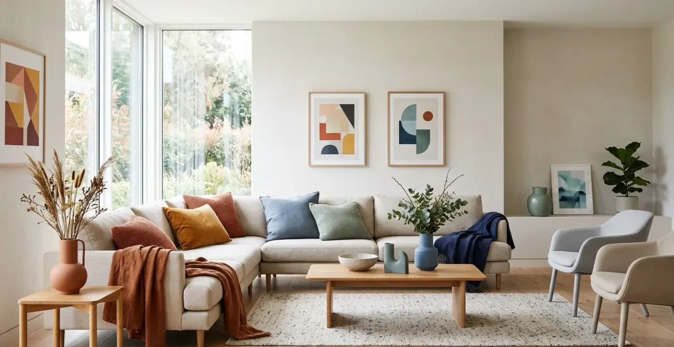
One of the biggest mistakes in seasonal decorating is ignoring the most dominant, permanent color in the room: your flooring. Wood floors, in particular, are not neutral. They possess strong undertones—yellow, red, or gray—that can either harmonize beautifully with your chosen seasonal palette or create a jarring, unpleasant clash. Understanding this principle of undertone harmony is crucial for any renter or homeowner who cannot change their floors.
Before you buy that trendy cerulean blue throw or a set of “Very Peri” cushions, you must first identify your floor’s undertone. A yellow-toned oak floor, for example, will naturally complement earthy greens and warm terracottas, making them feel rich and grounded. However, pairing it with a cool, violet-based purple can make the floor look sallow and the purple appear dull. Similarly, red-toned cherry or mahogany floors sing next to deep blues and warm grays but can look muddy when paired with certain yellow-greens.
The key is to select seasonal accent colors that share a similar temperature (warm or cool) with your floor’s undertone or are complementary in a way that creates intentional, pleasing contrast. An in-depth analysis of color matching for wood floors provides a clear framework for making these decisions, preventing costly and frustrating design mistakes.
| Wood Floor Type | Undertone Characteristics | Harmonious Seasonal Colors | Colors to Avoid |
|---|---|---|---|
| Yellow-Toned Woods (Oak, Pine) | Hints of yellow, warm honey tones | Earthy greens, warm terracotta, soft beiges, golden ochres | Cool pinks, icy blues, violet-based purples |
| Red-Toned Woods (Cherry, Mahogany) | Red, orange-pink, warm undertones | Deep blues, deep greens, warm grays, caramel tones | Yellow-greens, clashing orange tones, cool whites that create a pink cast |
| Gray-Toned Woods (Gray Oak, Driftwood) | Gray, blue, or green cool undertones | Soft pastel blues, muted earth tones (Cornwall Slate), cool neutrals | Highly saturated warm oranges, bright yellows |
| Neutral Woods (Maple varieties) | Balanced warm/cool mix, subtle undertones | Versatile — taupe, soft gray, off-white, most seasonal palettes work | Extreme saturation levels without bridging elements |
By using this knowledge, your seasonal decor choices become strategic rather than haphazard. You are no longer just dropping a trendy color into a room; you are weaving it into the existing foundation, creating a cohesive and professionally curated look every time. This is the difference between an amateur refresh and a sophisticated, atmospheric transformation.
The “Fast Fashion” Trap: Avoiding Cheap Decor That Fades in 3 Months
The temptation to grab a handful of trendy, inexpensive cushions and throws is strong, especially when trying to quickly incorporate a new seasonal palette. This, however, is the “fast fashion” trap of home decor. These items are often produced with low-quality materials and dyes that result in colors fading after one wash, seams splitting, and fabrics pilling within a single season. This not only wastes money but also contributes to a cycle of clutter and environmental waste.
Escaping this trap requires shifting your mindset from quantity to quality, and from trend-following to building a core collection of durable, timeless textiles. Learning to identify quality is a practical skill that empowers you to make better investments. It’s not about brand names; it’s about tangible, physical attributes you can assess right in the store. A high-quality piece will survive dozens of seasonal swaps, while a cheap one is essentially disposable.
When shopping, become a tactile detective. Feel the weight of the fabric. Check the density of the weave. A higher thread count (300+ for cushion covers) isn’t just for sheets; it indicates a tighter weave that holds dye better and resists wear. Prioritize robust closures like zippers over simple envelope-style backs, which lose their shape. For decorative objects, weight is often a sign of quality; a heavier ceramic piece is likely made from denser clay and less prone to chipping.
To put this into practice, use a physical checklist when you shop:
- Seam Strength: Gently pull at the seams. They should feel secure with no visible gaps or loose threads.
- Closure Quality: Opt for sturdy, well-sewn zippered closures on cushions. They protect the insert and maintain the shape far better than flimsy envelope closures.
- Material Density: For ceramics or decorative objects, check the weight. Heavier pieces often indicate higher-quality, more durable materials.
- Base Inspection: Look at the unglazed foot on the bottom of a ceramic vase or bowl. It can reveal the quality of the underlying clay and firing process.
- Color Fastness Test: If possible, gently rub a discreet area of a brightly colored textile with a white cloth or even a damp fingertip. If significant color transfers, the dye is of poor quality and will fade and bleed quickly.
By investing in fewer, better pieces, you build a versatile decor “wardrobe” that serves you for years, allowing you to layer in small, trendy items without relying on them for the core of your design.
How to Adjust Lighting Temperature to Make Summer Colors Pop?
While textiles and objects are important, the most powerful and flexible tool for seasonal transformation is one that takes up no physical space: light. Specifically, mastering color temperature choreography—the art of adjusting your lighting’s warmth or coolness—can completely change how colors are perceived in your home. This is especially effective in summer, when you want to make fresh, cool colors like blues, greens, and crisp whites feel vibrant and airy.
Lighting temperature is measured in Kelvin (K). Lower Kelvin values (2700K) produce a warm, yellow, cozy light, akin to a sunset. Higher Kelvin values (4000K-5000K) produce a cool, blue-white, energizing light, similar to bright daylight. To make your summer decor “pop,” you should shift your ambient and accent lighting towards the cooler end of the spectrum. A 4000K bulb will make a turquoise cushion look electric and a pale green throw feel refreshingly minty. The same decor under a warm 2700K light might appear muted, muddy, or even sickly.
Beyond Kelvin, another critical factor is the Color Rendering Index (CRI), a scale from 0 to 100 that measures how accurately a light source reveals the true colors of objects. For seasonal decorating, this is non-negotiable. A low-CRI bulb can make even the most beautiful, saturated fabric look dull. As lighting experts note, lighting with a CRI of 90-95 makes almost all colors vibrant and easily distinguishable, while a CRI below 80 can render them desaturated and drab. Investing in high-CRI smart bulbs is one of the best decisions a renter can make, as they allow you to adjust both Kelvin and brightness with an app, offering infinite atmospheric possibilities.
This table provides a simple guide for setting your lighting to enhance each season’s palette:
| Season | Recommended Kelvin Range | Color Impact | Best For |
|---|---|---|---|
| Summer | 4000-5000K (Cool Daylight) | Makes blues and greens vibrant and crisp; enhances coastal and fresh color palettes | Spaces with light linens, cool-toned textiles, bright summer decor |
| Spring | 3500-4000K (Neutral White) | Balanced rendering for pastels and fresh tones; maintains color accuracy without warmth | Transitional spaces with mixed warm/cool spring palettes |
| Autumn | 2700-3000K (Warm White) | Enriches oranges, deep reds, and earthy browns; adds depth to harvest tones | Spaces with terracotta, rust, golden ochre, and warm autumn textiles |
| Winter | 2700K (Warm White) or Candlelight simulation | Enhances reds, deep browns, and jewel tones; creates a cozy, intimate atmosphere | Living areas with rich winter textiles, deep colors, and hygge-inspired decor |
Why Does 4000K Lighting Make Modern Homes Feel Like Hospitals?
While a cool 4000K light is fantastic for making summer colors pop, a common mistake is using it as the *only* source of light in a room. When an entire space is bathed in a single, uniform, cool-toned brightness, it loses all depth, shadow, and warmth, resulting in the flat, sterile, and slightly unnerving ambiance often associated with clinical environments like hospitals or old-fashioned office buildings. This happens because it fights against our natural circadian rhythms.
Our bodies are evolutionarily programmed to respond to changes in light temperature throughout the day. This is a core concept in chromotherapy. As lighting specialists at Simón explain, this connection is deeply ingrained. In their work on how color influences us, they state:
The first light of the day, which is cold with a blue undertone, activates us. The sunset, which is a warm rosy colour, relaxes us and prepares us for rest.
– Simón Lighting Specialists, Chromotherapy: how colour influences us
A home lit exclusively at 4000K is perpetually stuck in “mid-day activation mode.” It lacks the warm, relaxing cues that signal safety and comfort, making the space feel functional but soulless. The solution is not to abandon 4000K light, but to implement a three-layer lighting design. This professional technique creates visual interest, defines zones, and balances color temperatures to build a rich, dimensional atmosphere.
By layering different types of light with varying functions and temperatures, you can have the best of both worlds: clear, functional light where you need it, and warm, atmospheric light to make the space feel like a home.
- Layer 1 – Ambient: This is your general, overhead lighting. It can be 4000K, providing the base level of illumination for the entire room.
- Layer 2 – Task: This is focused lighting for specific activities. Think of a 3500-4000K desk lamp for working, or under-cabinet lighting in the kitchen for food prep. It’s bright and functional, but contained to one area.
- Layer 3 – Accent: This is the critical layer that defeats the “hospital” feeling. It consists of warm-toned lamps (2700-3000K) used to highlight artwork, create a cozy reading nook, or cast a warm glow from a corner. This layer introduces shadow and warmth, creating depth and intimacy. A good rule of thumb is to ensure accent lighting makes up at least 30% of the light sources in a living space.
Using smart bulbs with adjustable temperatures in your accent fixtures is the ultimate tool for this system, allowing you to fine-tune the balance and shift the entire mood of the room from energizing and bright to cozy and intimate at the touch of a button.
Key Takeaways
- True seasonal refreshment comes from manipulating atmosphere through light and texture, not just adding trendy colors.
- Harmonizing accent colors with the fixed undertones of your floors and furniture is crucial for a cohesive look.
- A layered lighting strategy, mixing ambient, task, and warm accent light, is the most powerful non-permanent tool for changing a room’s mood.
The Risk of “Color of the Year” Investments for Long-Term Value
The annual announcement of the Pantone Color of the Year creates a flurry of activity in the design world, influencing everything from fashion to furniture. While it’s a fun and inspiring cultural moment, treating the Color of the Year as a directive for major purchases is a significant financial and aesthetic risk. These colors are, by definition, fleeting. Investing in a “Peach Fuzz” armchair or “Very Peri” rug means tying your decor to a trend with a built-in expiration date.
The influence is undeniable; color trend analysis shows that the Pantone choice directly impacts product palettes worldwide, as seen with the shift towards warm, muted tones like 2025’s Mocha Mousse. However, the savviest approach is to treat these colors as what they are: temporary accents. The wisest investments are always in neutral, foundational pieces and high-quality textiles whose value transcends a single year’s trend cycle.
A deeper analysis of color trends reveals a clear pattern regarding longevity, which is essential for anyone decorating on a budget. This is where understanding the source of color inspiration becomes a powerful tool for predicting its staying power.
Long-Term Color Trend Analysis: Natural vs. Synthetic Pigment Longevity
Strategic color analysis from Accio confirms that earthy, natural tones have significantly more staying power. Colors derived from natural pigments—like ochres, terracottas, and deep greens—often remain relevant for 3 to 5 years. In contrast, highly artificial or synthetic-looking colors, such as neons or specific vibrant magentas, typically fade from trend relevance within just 12 to 18 months. The analysis shows that while hyper-saturated digital palettes exist, enduring demand remains for adaptable, warm hues like Truffle Brown and Mocha Mousse, which are predicted to stay strong through 2025-2026. This data provides a clear investment case for prioritizing natural palettes for any long-term decor pieces.
This doesn’t mean you must ignore the Color of the Year entirely. The trick is to incorporate it in small, low-cost, non-permanent ways. Think of a vase, a set of candles, a piece of digital art on a screen, or a single cushion cover. These items provide a nod to the trend without a significant commitment. Let the trendy color be the “spice,” not the “main course” of your interior design. This allows you to participate in the fun of the current moment while ensuring your home’s core style remains timeless and valuable.
How to Refresh Home Decor Seasonally Without Storing Boxes of Stuff?
We’ve established that seasonal refreshing is about atmospheric alchemy, not accumulation. But even with a curated collection of textiles, the ultimate goal for many—especially those in small spaces—is the zero-footprint refresh. This is the art of transforming your space using strategies that require little to no physical storage. It’s about leveraging senses, subtraction, and smart technology to create a profound shift in ambiance.
This approach moves beyond the visual to engage other senses. A powerful, zero-storage technique is the sensory palette swap. Pair your visual theme with a corresponding scent profile using an essential oil diffuser or candles. A summer room with linen textiles and green accents is elevated by a fresh basil and citrus scent. A cozy winter space with deep reds and velvet feels complete with the aroma of cinnamon and clove. The change is immediate and deeply atmospheric, yet takes up no closet space.
Another key is the art of subtraction. Instead of asking “What can I add?”, ask “What can I take away?”. In summer, removing heavy curtains to maximize natural light or decluttering bookshelves to feature just two or three objects in a seasonal color can have a more dramatic impact than adding a dozen new items. As the team at Diyversify astutely puts it in their guide to seasonal refreshing:
It’s not about owning four versions of everything but about choosing versatile pieces that can easily transition from one season to the next with a little creativity.
– Diyversify, Tips for Refreshing Your Home’s Decor Every Season
This philosophy of versatility and creativity is the heart of the zero-storage refresh. Here are some advanced strategies to achieve it:
- Reversible Investments: Purchase dual-sided throws (e.g., velvet on one side, linen on the other) or cushion covers with multi-tonal patterns that can be folded or displayed to emphasize different colors.
- Digital Decor: Use a smart TV’s art mode (like Samsung’s The Frame) to display rotating digital art collections that match your seasonal palette. This offers a massive visual change with zero physical footprint.
- Temporary DIY: Get creative with non-permanent materials. Apply removable vinyl to a serving tray, use washable fabric dye to temporarily tint neutral cushion covers, or wrap existing books on a shelf with seasonal-colored paper.
By embracing these strategies, you are no longer a passive consumer of trends but an active curator of your own environment. You can achieve a home that feels dynamic, personal, and constantly evolving, all while keeping your closets clear and your budget intact.
Now that you are equipped with the principles of atmospheric alchemy, you can begin to look at your home not as a static space, but as a canvas for mood and emotion. Start today by implementing these strategies to transform your results and create an interior that truly reflects the season.