Using a bold, busy wallpaper is the single most effective way to make a small powder room feel expansive and luxurious, not cramped.
- The key is “Boundary Dissolution,” an optical effect where complex patterns obscure the room’s corners and edges, tricking the eye.
- Success depends on technical choices: traditional pasted wallpaper for seamless quality and a decorator’s varnish for essential water-proofing.
Recommendation: Ditch the fear of ‘too much’ and focus on mastering the technical details of installation and lighting for a guaranteed ‘jewel box’ result.
The powder room. A small, contained space that should be the perfect laboratory for design experimentation. Yet, the fear of ‘making it feel smaller’ often leads to the safest, most forgettable choice: neutral paint. This hesitation is understandable. Common advice encourages you to ‘go bold’ or ‘have fun,’ but this offers little comfort when you’re holding an expensive roll of graphically intense wallpaper, worried about clashing patterns, peeling seams, and a final result that feels chaotic rather than chic.
But what if the key wasn’t just courage, but competence? What if the secret to transforming a tiny bathroom into an immersive ‘jewel box’ was less about bravery and more about understanding the science of pattern, light, and material? The truth is, making a bold statement is a technical discipline. When you master the principles of pattern matching, humidity control, and lighting, you move from hoping for a good result to engineering one. This is not about being reckless with design; it is about being radically intentional.
This guide moves beyond encouragement to provide the technical framework you need. We’ll deconstruct the process, showing you how to manage large patterns without excessive waste, defeat humidity, choose materials for a genuinely high-end finish, and even use lighting and murals to manipulate the perception of space itself. Prepare to trade fear for precision.
In this detailed guide, we provide the technical answers to the most pressing questions about using bold wallpaper in a compact space. The following sections will equip you with the knowledge to execute your project with confidence.
Summary: The Technical Guide to Bold Wallpaper in Small Powder Rooms
- How to Match Large Scale Patterns Without Wasting 50% of the Roll?
- The Humidity Risk: Will Wallpaper Peel in a Shower Room?
- Peel-and-Stick vs Traditional Paste: Which Looks More High-End?
- How to Seal Wallpaper Behind a Sink to Prevent Water Damage?
- Why Do Small Rooms Handle “Busy” Prints Better Than Large Halls?
- How to Use Lighting to Change Wall Tones Without Painting?
- Vinyl Decal vs Hand-Painted: Which Looks High-End on Close Inspection?
- How to Use Interior Murals to Alter Depth Perception in Small Rooms?
How to Match Large Scale Patterns Without Wasting 50% of the Roll?
The number one deterrent for using large, dramatic patterns is often the fear of waste. It’s a valid concern; with drop-match patterns featuring large repeats, it’s not uncommon for calculations to show potential waste over 25% per strip. However, this waste is a product of inefficient technique, not an inevitability. Mastering the art of the match is about strategic planning before a single cut is made, turning a costly problem into a satisfying puzzle.
The first step is identifying your pattern’s match type. A random match requires no alignment and produces virtually no waste. A straight match aligns horizontally, creating moderate waste. The most complex, the drop match, staggers the pattern both horizontally and vertically and can be the biggest source of offcuts. But even here, strategic thinking prevails. Instead of starting at a random corner, you must identify the room’s primary focal point—usually the wall you see first upon entering—and begin your installation there. This ensures the most impactful part of the pattern is perfectly centered, while any necessary sacrifices or awkward cuts are relegated to less visible areas, like behind the door or in a corner obscured by the vanity.
Advanced techniques can further minimize offcuts. The ‘Digital Templating’ method, for example, involves using an app to virtually tile your pattern onto a photo of your wall, allowing you to plan every cut digitally. This level of precision transforms the process from guesswork to a calculated execution.
- Identify Your Pattern Match Type: Understand if you have a random, straight, or drop match. This dictates your entire strategy.
- Use the ‘Digital Templating’ Method: Photograph your wall and pattern. Use an app like Procreate or even PowerPoint to virtually tile the wallpaper onto the wall photo, planning cuts before you touch the roll.
- Apply the ‘Focal Point First’ Strategy: Center the most important motif on the most visible wall. Work outwards from this point, pushing any pattern compromises to inconspicuous corners.
- Try Alternate Roll Matching: For drop patterns, instead of cutting the next strip from the same roll, match it against a second roll. This often provides a closer match with less waste.
- Explore ‘Bookmatch’ Techniques: For non-repeating murals, consider ‘bookmatching’ panels to create a symmetrical, Rorschach-like effect, a high-design technique borrowed from luxury woodworking.
The Humidity Risk: Will Wallpaper Peel in a Shower Room?
The persistent myth that wallpaper and bathrooms are incompatible stems from a misunderstanding of the true enemy: uncontrolled moisture. It’s not the presence of humidity, but the failure to manage it, that leads to peeling seams and mold growth. A properly ventilated powder room where humidity levels are kept within the recommended range of 30% to 60% is a perfectly suitable environment for wallpaper. The key is to build a robust, multi-layered defense system that makes your walls impervious to moisture from the drywall out.
This defense starts long before the wallpaper is even unrolled. The wall itself must be sealed. Applying a mold-inhibiting wallpaper primer (a process called ‘sizing’) is non-negotiable. This creates a barrier that prevents the wall from absorbing moisture from the air or the paste, and it provides a uniform surface for the adhesive to grip. Next is the adhesive itself. Using a standard, all-purpose paste is a recipe for failure. You must select a mildew-resistant, heavy-duty clay-based adhesive specifically formulated for high-humidity environments. This ensures a tenacious bond that won’t release its grip when things get steamy.
The final layer of protection is a top coat. Once the wallpaper is installed and fully cured, applying two to three thin coats of a water-based polycrylic decorator’s varnish in a dead flat finish provides an invisible, non-yellowing waterproof barrier. This seals the seams and the paper’s surface, allowing you to wipe away splashes without a second thought. Combined with active ventilation, this three-part system makes wallpaper not just viable, but durable in a powder room.
Your 5-Point Audit for a Humidity-Proof Installation
- Wall Preparation: Verify the wall is sealed with a mold-inhibiting wallpaper primer (sizing) over a satin or semi-gloss paint finish. This prevents moisture absorption and ensures strong adhesion.
- Adhesive Selection: Confirm you are using a mildew-resistant, heavy-duty adhesive specifically formulated for high-humidity environments, not a standard all-purpose paste.
- Surface Sealing: Plan to apply 2-3 thin coats of a water-based polycrylic decorator’s varnish (dead flat finish) over the installed paper to create an invisible, waterproof top coat.
- Ventilation System: Check if the room has an adequate exhaust fan. For ultimate protection, install a fan with a built-in hygrostat that activates automatically when humidity rises.
- Splash Zone Strategy: Assess the area directly behind the sink. Consider installing a 6-12 inch solid surface backsplash and starting the wallpaper above it to eliminate risk in the highest splash zone.
Peel-and-Stick vs Traditional Paste: Which Looks More High-End?
In the quest for a bold powder room, the allure of peel-and-stick wallpaper is strong. It promises a low-commitment, DIY-friendly solution. However, when the goal is a truly high-end, transformative result, the conversation must shift from convenience to quality. While peel-and-stick has its place, traditional, unpasted wallpaper applied with paste is unequivocally the superior choice for achieving a luxurious, permanent, and seamless finish. The difference lies in material honesty, texture, and, most critically, seam integrity.
The fundamental flaw of many peel-and-stick products is their material composition—often a thin vinyl that can shrink or expand with temperature and humidity changes. This dimensional instability is what leads to the dreaded “shrinking seam” phenomenon, where small gaps appear between panels over time, cheapening the overall effect. Furthermore, the adhesive backing, while convenient, is unforgiving. It prevents the subtle sliding and repositioning that is essential for perfecting the alignment of a complex pattern. A traditional wet-pasted paper, by contrast, allows for micro-adjustments during installation, enabling an installer to butt the seams so perfectly they become virtually invisible.
Texture and finish are the final arbiters of quality. Peel-and-stick papers often have an unavoidable vinyl sheen that reflects light in a way that signals “sticker.” Traditional papers, however, are available in a vast range of tactile finishes, from grasscloth and silk to deeply embossed patterns with a chalky, matte finish that absorbs light beautifully, adding depth and sophistication. As the following comparison shows, the investment in a traditional application pays dividends in every aesthetic detail.
This decision goes beyond simple aesthetics, as a comparative analysis of quality indicators reveals significant differences in performance and longevity.
| Quality Factor | Peel-and-Stick | Traditional Paste |
|---|---|---|
| Seam Quality | Can shrink over time creating visible gaps; adhesive less forgiving | Butted seams become imperceptible; paste allows repositioning for perfect alignment |
| Texture & Sheen | Often unavoidable slight vinyl sheen that reflects light and cheapens appearance | Tactile finishes available (grasscloth, silk, embossed); deep matte chalky finish absorbs light beautifully |
| Wall Conformance | Less forgiving; can bubble or lift over wall imperfections, revealing flaws | Conforms perfectly to slight wall imperfections when applied with paste |
| Longevity | 3.5-5+ years; affected by humidity and temperature fluctuations | 10-15 years with proper installation; more durable construction |
| Installation Adjustability | Sticky backing prevents sliding; must peel and reapply if not straight | Wet paste allows manipulation and repositioning before drying for perfect placement |
| Dimensional Stability | Can warp, stretch, or shrink with humidity changes causing seams to open | Dimensionally stable; won’t expand or contract significantly |
How to Seal Wallpaper Behind a Sink to Prevent Water Damage?
Even with the most robust wallpaper and adhesive, the area directly behind the sink—the “splash zone”—is the point of highest vulnerability. Constant splashes can compromise even the best-laid seams over time. While some opt for a tile or stone backsplash, this can disrupt the immersive, wall-to-wall pattern that makes a powder room so dramatic. The professional solution is to render the wallpaper itself waterproof through a specific sealing process, creating an invisible shield that preserves the design’s integrity.
The tool for this task is a high-quality, water-based polycrylic or decorator’s varnish. It’s crucial to choose a product that dries completely clear and is non-yellowing. The best choice for preserving the wallpaper’s intended look is a “dead flat” or “matte” finish, which will be virtually invisible once dry, unlike satin or gloss finishes that would alter the paper’s sheen. The application must be done with precision and patience.
As shown in the detail above, the key is to apply the varnish in multiple, very thin coats rather than one thick one. Using a high-quality, soft-bristled brush, apply the first coat and let it dry completely according to the manufacturer’s instructions. Lightly sand with very fine-grit sandpaper (220-grit or higher) to knock down any bumps, wipe clean with a tack cloth, and then apply a second coat. For a high-traffic powder room, a third coat is recommended for maximum durability. This meticulous process creates a hard, waterproof shell over the paper and, most importantly, seals the vulnerable seams against any moisture intrusion, ensuring your bold design remains flawless.
Why Do Small Rooms Handle “Busy” Prints Better Than Large Halls?
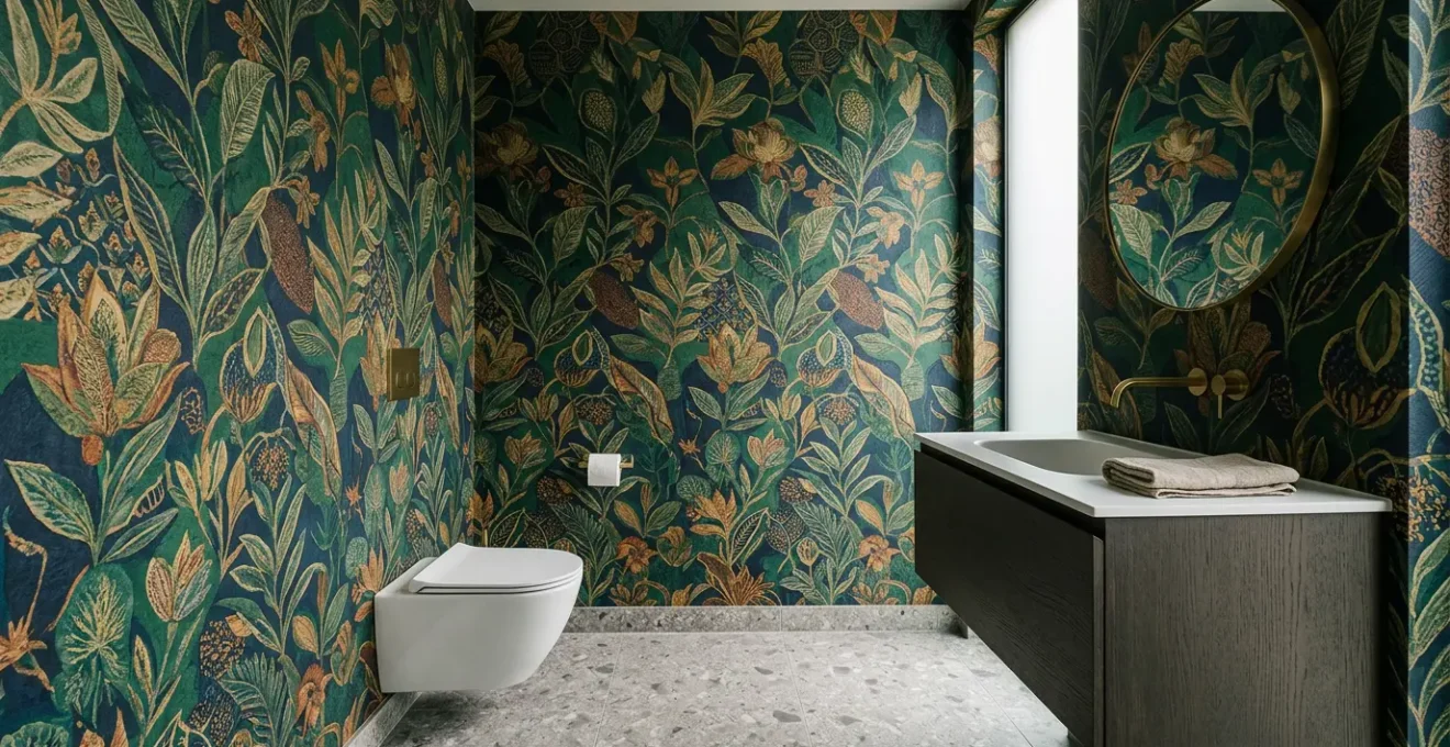
The counter-intuitive principle that a small room can be visually expanded with a busy, large-scale pattern is one of the most powerful and misunderstood concepts in interior design. The fear is that a bold print will feel overwhelming and claustrophobic. In reality, when executed correctly, it achieves the exact opposite. This phenomenon is rooted in a psychological trick of perception known as “Boundary Dissolution.”
In a large, open space like a hallway, a busy pattern competes with long sightlines, multiple doorways, furniture, and art. The brain is overstimulated with visual information, and the pattern becomes “noise.” In a small, enclosed powder room, however, the wallpaper isn’t just decoration; it becomes the environment itself. A complex, non-linear pattern wraps the space and camouflages the corners and edges where walls meet. The eye struggles to define the room’s physical limits, and without clear boundaries to register, the space paradoxically feels more expansive and boundless. This is the essence of the “Jewel Box Effect”—creating a fully immersive, contained world that transcends its small dimensions.
This effect is most potent when the design choice is total and uncompromising. Covering all four walls and even the ceiling creates a complete “Forced Immersion” that maximizes the boundary-dissolving effect. A single accent wall, by contrast, breaks the illusion by clearly defining the room’s other three boundaries.
Case Study: The ‘Jewel Box Effect’ in Practice
As designers frequently leverage in powder rooms, the ‘Forced Immersion’ or ‘Jewel Box Effect’ is an intentional strategy. In these small spaces, complex patterns create an immersive environment rather than appearing as simple decorated surfaces. The core technique is ‘Boundary Dissolution,’ where intricate, non-linear patterns camouflage corners and edges. This makes it difficult for the eye to define the room’s limits, paradoxically creating a sense of expansion. In large rooms, busy patterns create visual noise by competing with furniture and long sightlines. But in a powder room, the wallpaper becomes the undisputed focal point, resulting in a cohesive statement. Because the door is often closed, the room exists as a delightful surprise, making it the ideal testing ground for a homeowner’s boldest design ideas.
How to Use Lighting to Change Wall Tones Without Painting?
Wallpaper is not a static surface; its appearance is a dynamic interplay between pattern, color, and light. The most expertly chosen wallpaper can be ruined by poor lighting, while a sophisticated lighting scheme can elevate it into a work of art. Thinking of light as a material—one that you can layer and direct—is the key to unlocking the full potential of your bold pattern. This allows you to dramatically alter the mood and tone of the room with the flip of a switch, without ever touching a paintbrush.
The first technical consideration is the quality of the light itself, measured by the Color Rendering Index (CRI). A low CRI bulb (below 80) will fail to render the paper’s true colors, making vibrant hues appear dull and muddy. For expensive, color-rich wallpaper, selecting LED bulbs with a CRI of 90 or above is essential to see the pattern as the designer intended. The second factor is color temperature. By layering different temperatures—for example, a brighter, neutral 3000K overhead light for daytime function and warmer, intimate 2700K sconces by the mirror for evenings—you can create distinct moods within the same space.
The direction of light is your final tool. As the image illustrates, different lighting techniques produce wildly different effects. Wall-grazing fixtures, placed very close to the wall, cast light at a sharp angle, creating dramatic shadows that accentuate the texture of embossed or grasscloth papers. Conversely, soft, diffused light will flatten a pattern, making it more subtle. Installing dimmers on all light sources is the ultimate power move, giving you granular control to dial in the perfect atmosphere for any moment.
- Prioritize High CRI (Color Rendering Index): Demand LED bulbs with a CRI of 90+ to render your wallpaper’s colors accurately and richly.
- Implement Multi-Temperature Layering: Combine different light temperatures (e.g., 3000K overhead, 2700K sconces) to create distinct moods for day and night.
- Use Directional Light for Texture: Install wall-grazing fixtures to cast dramatic shadows and highlight the physical texture of embossed or natural-fiber papers.
- Employ Diffuse Light for Subtlety: Use fixtures with frosted shades or diffusers to soften the light, which can flatten a pattern for a more subtle, less dramatic effect.
- Install Dimmer Controls on Everything: Dimmers are non-negotiable. They provide the ultimate control, allowing you to fine-tune the intensity and mood of the room throughout the day.
Vinyl Decal vs Hand-Painted: Which Looks High-End on Close Inspection?
When elevating from wallpaper to a full-scale mural, the choice between a printed vinyl decal and a hand-painted piece becomes a critical question of authenticity and luxury. While modern printing technology has made custom vinyl murals more accessible, a hand-painted mural occupies a different category of design altogether. On close inspection, the differences are not just visible but tactile and visceral. The pursuit of a truly high-end look is a vote for material honesty—and in this, paint on a wall will always feel more authentic than vinyl pretending to be paint.
The first tell-tale sign is the edge quality. A vinyl decal has a perfect, machine-cut edge that, under scrutiny, can create a subtle “sticker” effect against the wall’s texture. A hand-painted line, by contrast, has microscopic imperfections and a natural bleed into the wall’s surface that signals the human hand. This imperfection is not a flaw; it is the signature of craftsmanship. The second indicator is luminosity. A printed decal consists of a single, uniform layer of ink, resulting in a flat appearance. A painted mural is built up in multiple, often translucent, layers. This allows light to interact with the pigments in a complex way, creating a subtle, living luminosity that a print cannot replicate.
Ultimately, the perception of luxury is tied to the sense of uniqueness and artistry. A custom-printed decal, while unique in its design, can still feel mass-produced in its execution. A hand-painted mural is a bespoke work of art, an investment in an artist’s time and skill. This inherent value is palpable and is what distinguishes a well-decorated room from a truly designed space.
The distinction is clear when assessing the core attributes of quality, as highlighted by an in-depth quality assessment of both mediums.
| Quality Indicator | Vinyl Decal | Hand-Painted Mural |
|---|---|---|
| Edge Quality | Perfect, sharp, machine-cut edge that can create ‘sticker’ look under close inspection | Microscopic imperfections and natural bleeds into wall texture signal authenticity and human touch |
| Luminosity & Depth | Single uniform layer of printed ink; flat appearance with limited light interaction | Multiple paint layers interact with light complexly; opaque and translucent pigments create subtle living luminosity |
| Material Honesty | Vinyl trying to mimic painted look can fail authenticity test on close inspection | Honest material—paint on wall—remains authentic to its own material properties |
| Texture | Smooth vinyl surface; tactile flatness | Visible brush strokes, paint build-up, natural surface variation |
| High-End Perception | Can appear mass-produced despite custom printing | Signals bespoke craftsmanship, uniqueness, investment in artistry |
| Longevity Appearance | Vinyl sheen can cheapen over time; edges may lift | Ages with character; patina enhances authenticity |
Key Takeaways
- Success with bold wallpaper is technical, not just aesthetic. Focus on humidity-proofing, seamless installation, and strategic lighting.
- For a truly high-end finish, traditional pasted wallpaper is superior to peel-and-stick due to its seamless look, dimensional stability, and richer textures.
- Busy, large-scale patterns make small rooms feel larger through “Boundary Dissolution,” an optical illusion that obscures the room’s physical corners.
How to Use Interior Murals to Alter Depth Perception in Small Rooms?
If bold wallpaper can dissolve a room’s boundaries, a well-chosen mural can obliterate them entirely. Murals are the ultimate tool for manipulating depth perception, using centuries-old artistic techniques to create a powerful illusion of space on a flat surface. This is not just about adding a pretty picture; it’s about fundamentally rewriting the room’s architecture. The most effective murals for a small powder room are those that employ specific fine art principles to trick the eye.
The most powerful of these is Atmospheric Perspective. This technique mimics how we see things in the real world: distant objects appear lighter, less detailed, and cooler in tone (bluer). A mural depicting a landscape where the foreground elements are sharp, dark, and warm-toned, while the background recedes into hazy, pale blues, will create a profound and convincing sense of depth. Another potent method is Trompe-l’œil (French for “deceive the eye”). Murals that depict architectural features—an archway opening onto a garden, a window with a view, or even a set of bookshelves—create a narrative and a compelling illusion that the room extends far beyond its physical walls.
Placement is everything. To maximize the impact, the mural should be installed on the wall directly opposite the entryway. This creates an immediate and dramatic effect the moment you enter the space. A particularly daring and effective strategy is to treat the ceiling as the “fifth wall,” applying a mural of a sky, celestial map, or abstract receding pattern. This draws the eye upward, creating a powerful sense of height and completely dissolving the room’s boxy feeling. By selecting a mural based on these artistic principles, you’re not just decorating; you are actively reshaping perception.
- Atmospheric Perspective: Choose murals where “distant” elements are lighter, less contrasted, and cooler-toned (bluer) to create a convincing illusion of deep space.
- Ceiling as Canvas Strategy: Apply a mural to the ceiling to draw the eye upward and create a profound sense of height, dissolving the room’s confines.
- Trompe-l’œil Architectural Features: Select murals depicting windows, archways, or libraries to create a narrative illusion of a space beyond the wall.
- Large-Scale Scenic Murals: Use expansive landscape or tropical scenes to establish an environmental context that mentally transcends the physical room.
- Strategic Placement: Always position a depth-creating mural on the wall opposite the door to maximize its impact upon entry.
Armed with this technical knowledge, you can approach your powder room project not with fear, but with the confidence of a seasoned designer. The “jewel box” effect is not a happy accident; it is the direct result of intentional choices in materials, installation, and lighting. Start by selecting a traditional, high-quality pasted wallpaper and planning your layout to minimize waste. Commit to the three-part humidity defense system. And finally, design a layered lighting scheme that brings your chosen pattern to life. Execute these steps, and you will create a space that is not just bold, but brilliant.