In summary:
- A monochrome palette tricks the brain by eliminating “visual breaks,” making the eye see one continuous, larger space.
- To avoid a sterile look, layer varied textures (boucle, linen, plaster, wood) to create “textural topography” that adds depth and interest.
- Use strategic lighting with warm-toned bulbs (2700K) and multiple sources to “paint” walls with warmth and create an inviting atmosphere.
- In small, defined spaces, a busy all-over pattern can create an immersive “jewel-box” effect that dissolves boundaries.
If you live in a studio apartment, you’re intimately familiar with the daily Tetris game of life. The feeling of walls closing in isn’t just a cliché; it’s a tangible, spatial reality. For years, the go-to advice has been a predictable chorus: “paint it white,” “declutter,” and “buy smaller furniture.” These tips aren’t wrong, but they only skim the surface. They treat the symptom—the lack of square footage—without understanding the root cause of feeling cramped: how our brain perceives the space.
What if the real secret to expanding your apartment wasn’t about physical space at all, but about mastering a powerful optical illusion? The true magic lies beyond a simple coat of beige paint. It’s in understanding the subtle science of monochrome design. This isn’t just about picking one color; it’s about crafting a continuous visual journey that convinces the eye—and therefore the brain—that the room’s boundaries are further away than they truly are. It’s an act of design alchemy, transforming a confined box into an expansive sanctuary.
This guide will deconstruct that magic. We will explore the psychology behind why eliminating color breaks works, dive into the art of layering textures to add sophisticated warmth, and reveal how to use light itself as a paintbrush. Prepare to move beyond the platitudes and learn the optical wizardry that makes small spaces feel boundless.
This article provides a comprehensive walkthrough of the principles and techniques you need to master. Explore the topics that pique your interest through the summary below.
Summary: The Science of Visual Expansion
- Why Does Eliminating Color Breaks Trick the Brain?
- How to Layer Textures to Avoid the “Boring Beige” Trap?
- The “Hospital Effect”: Signs Your White Room Is Too Sterile
- Warm Grey vs Cool Grey: Which Expands North-Facing Rooms?
- How to Use Lighting to Change Wall Tones Without Painting?
- How to Identify Non-Load Bearing Walls Without a Contractor?
- Why Do Small Rooms Handle “Busy” Prints Better Than Large Halls?
- How to Warm Up Modern Interiors Without Cluttering the Lines?
Why Does Eliminating Color Breaks Trick the Brain?
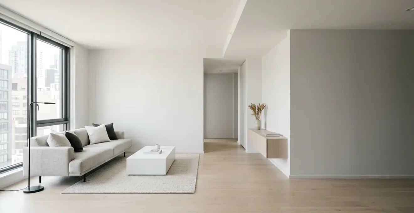
The core of monochrome’s power lies in a principle called cognitive fluency. Our brains are wired for efficiency; they prefer to process information that is simple and seamless. When your eye scans a room, every sharp contrast in color—from a dark sofa against a light wall, to a different-colored trim, to a door frame—acts as a “visual break.” Each break is a tiny stop sign, forcing your brain to stop, process a new piece of information, and mentally segment the space. The more segments it creates, the smaller and more complex the room feels.
A monochrome palette removes these stop signs. By using varying tones, shades, and tints of a single hue across walls, trim, furniture, and even the ceiling, you create a continuous visual field. Your eye travels uninterrupted from floor to ceiling and corner to corner. This lack of visual friction makes the entire space easier for your brain to “read.” It perceives the room as one unified, cohesive whole rather than a collection of disparate parts. This seamlessness leads to boundary dissolution, where the hard lines of corners and edges soften, tricking the mind into perceiving the space as more expansive and open.
This perceptual trick is well-documented in environmental psychology. We know that our sense of space is highly malleable; for example, a 2024 study on spatial perception confirmed that factors like the size of windows directly influence our feeling of spaciousness. Just as a large window provides an uninterrupted view outward, a monochrome scheme provides an uninterrupted view *within*. It’s not magic—it’s leveraging the predictable shortcuts of our own perception to create a feeling of serene openness.
How to Layer Textures to Avoid the “Boring Beige” Trap?
The single greatest fear for anyone attempting a monochrome scheme is the “boring beige” trap—a space so uniform it feels flat, lifeless, and devoid of personality. The antidote to this is not to add a splash of color, but to replace color variation with a rich and sophisticated textural topography. When you limit the palette, your other senses heighten. Texture becomes your new color, providing the visual interest and depth the space needs.
Think of it as composing a symphony not with different instruments, but with different ways of playing a single violin—pizzicato, legato, staccato. You can achieve this by layering materials with contrasting properties. Pair a soft, light-absorbing material like a boucle or velvet sofa with a hard, light-reflecting surface like a marble coffee table. Juxtapose a rough, hand-applied plaster wall with the smooth, cool-to-the-touch feel of linen curtains. This interplay of rough and smooth, matte and glossy, hard and soft creates a dynamic sensory experience that is far more sophisticated than a simple pop of color.
The key is to create a tactile rhythm that guides the eye. As seen in the detail above, the visual weight of a nubby wool rug on the floor, the delicate weave of a throw blanket, the natural grain of a light oak side table, and the subtle sheen of a ceramic lamp all contribute to a complex, layered whole. These are not just objects; they are notes in a textural composition that makes a neutral room feel rich, curated, and deeply inviting.
The “Hospital Effect”: Signs Your White Room Is Too Sterile
There is a fine line between minimalist serenity and clinical sterility. This is the “Hospital Effect,” where a well-intentioned all-white or neutral room ends up feeling cold, unwelcoming, and acoustically harsh. It lacks the subtle, multi-sensory cues that signal comfort and safety to our brains. A room that relies solely on a single shade of white with no variation in texture or lighting often fails the human test—it looks good in a photo but feels sterile to live in. It’s a space that’s seen but not felt.
The problem is often a lack of sensory diversity. Sterile spaces are typically characterized by an overabundance of smooth, hard, non-porous surfaces that reflect sound and light in a flat, uniform way. This creates sharp acoustic reverberations and a shadowless glare that can be visually fatiguing. Without soft surfaces to absorb sound, natural materials to provide a connection to the outdoors (a concept known as biophilia), and varied lighting to create mood, the room can feel soulless and impersonal.
Recognizing the signs is the first step toward a cure. A truly comfortable space engages more than just the eyes. It considers acoustics, the quality of light, and the tactile feel of its surfaces. Before you can warm up a sterile room, you must first diagnose what sensory elements are missing. The following checklist helps you perform a multi-sensory audit of your own space.
Your Multi-Sensory Diagnostic Checklist: Is Your Room Too Sterile?
- The Acoustic Test: Clap your hands loudly. Does the sound echo sharply and harshly? If so, the room lacks soft, sound-absorbing elements like rugs, curtains, or upholstered furniture that prevent sound from bouncing off hard surfaces.
- The Flat Light Check: Count your light sources. If your only light is a single overhead fixture, you have flat light. A warm, inviting room has layers of light at different heights—floor lamps, table lamps, sconces—that create pools of warmth and gentle shadows.
- The Biophilia Assessment: Look around for life. Is there anything with a natural grain or pattern, like plants, a wooden bowl, or a marble tray? An absence of these “living” elements is a key indicator of sterility.
- The Texture Inventory: Run your hands over five different surfaces. Do they all feel the same—smooth, hard, and cool? A lack of variation between matte, satin, rough, and plush finishes means the room is texturally monotonous.
- The Sensory Stimulation Audit: How does the room *feel*? Architects evaluate spaces on factors like safety and social connectedness. Does your room feel safe, promote easy movement, and offer a sense of comfort? If it feels more like a waiting room, it’s failing this audit.
Warm Grey vs Cool Grey: Which Expands North-Facing Rooms?
Not all neutrals are created equal, especially when it comes to the challenging light of a north-facing room. These rooms receive no direct sunlight, only indirect, cool, blue-toned light throughout the day. A common mistake is to choose a cool grey (one with blue or green undertones) in an attempt to be modern and airy. In a north-facing room, however, this cool light will amplify the grey’s cool undertones, making the room feel icy, stark, and smaller.
The secret alchemical trick here is to work *with* the light, not against it. To create a sense of expansive warmth, you need to counteract the cool blue light with a warm grey. These are greys with subtle yellow, beige, or even red undertones. When the cool northern light hits a warm grey wall, the undertones cancel each other out, resulting in a color that reads as a true, sophisticated neutral. Instead of feeling cold and receding, the room feels balanced, enveloped, and surprisingly spacious. The warmth is inviting, pulling you into the space rather than pushing you away.
Choosing the right grey is a critical decision that depends entirely on the quality of light in your room. The wrong choice can make a room feel like a chilly concrete box, while the right one can transform it into a cozy, expansive haven. The following table breaks down how these two types of grey perform under the specific conditions of northern light.
This choice is crucial for the room’s atmosphere, as detailed in an analysis of paint colors for north-facing rooms.
| Factor | Warm Grey (with yellow/beige/red undertones) | Cool Grey (with blue/green undertones) |
|---|---|---|
| Light Interaction | Cancels out cool blue northern light, creates balanced neutral | Amplified by northern light, can feel stark and icy |
| Perceived Spaciousness | More inviting neutral feels more expansive | Can appear darker and more compact |
| Undertone Behavior | Brown/violet undertones soften the gray, add subtle warmth | Blue/purple/green undertones intensified, room feels cooler |
| Best Application | Primary wall color for north-facing spaces requiring warmth | Accent walls or rooms with abundant natural/artificial lighting |
| Required Supplements | Still needs warm interior lighting and texture | Must add warm accent colors, wood tones, brass/gold metals |
How to Use Lighting to Change Wall Tones Without Painting?
One of the most potent tools in the small-space wizard’s arsenal is “light painting.” This is the art of using artificial light to fundamentally change the perceived color and mood of your walls without ever touching a can of paint. The color of your walls isn’t a static fact; it’s a conversation between the paint pigment and the light that hits it. By changing the light, you change the color.
The most crucial factor here is color temperature, measured in Kelvin (K). Many modern homes are overlit with high-Kelvin, cool-toned LED bulbs (4000K-5000K) that emit a blue-white light similar to an overcast day. This light is great for task-oriented spaces like kitchens, but in a living area, it can make even the warmest beige feel sterile and cold. As research on lighting and color perception shows, switching to warm-white bulbs is transformative. Bulbs in the 2700K to 3000K range cast a golden, candle-like glow that instantly makes a room feel more inviting, cozy, and warm. It can turn a cool, flat grey into a rich, complex greige, or a simple white into a creamy, soft ivory.
But temperature is only the beginning. Professional designers layer light from multiple sources at different heights to create depth and drama. Instead of relying on a single overhead “light bomb,” they create “pools” of light with floor lamps, highlight art with a picture light, and wash walls with uplighters. This layered approach not only makes a space more functional but also allows you to sculpt the room with light and shadow, highlighting your carefully chosen textures and making the monochrome palette sing.
- Master the Kelvin Scale: Use smart bulbs to change your wall color on demand. A 2700K setting will add a golden, cozy warmth, while a 4000K setting can create a crisp, energizing feel for daytime.
- Demand High CRI (90+): The Color Rendering Index (CRI) measures how accurately a light source reveals color. Cheap, low-CRI LEDs will flatten your beautiful monochrome scheme, making everything look dull. High-CRI bulbs make tonal variations and textures “pop.”
- Practice Wall Grazing: To emphasize a textured surface like brick or grasscloth, place a light source very close to the wall, aimed at a steep angle. This creates dramatic shadows that highlight the material’s topography.
- Employ Wall Washing: For an expansive feel, place track lighting or floor uplighters further from the wall. This creates a smooth, even wash of light that minimizes texture and makes the surface feel clean and uniform.
How to Identify Non-Load Bearing Walls Without a Contractor?
After exhausting every visual trick in the book—monochrome palettes, textural layering, light painting—the ultimate act of spatial alchemy remains: physically removing a boundary. The idea of knocking down a wall to combine a cramped kitchen and a small living room into one open, airy space is the dream for many apartment dwellers. However, this is one magic trick you cannot afford to get wrong. Accidentally removing a load-bearing wall can compromise the structural integrity of your entire building, leading to catastrophic and costly consequences.
A non-load-bearing wall, often called a partition wall, exists only to divide space. It carries no weight from the floor above it. A load-bearing wall, on the other hand, is a crucial part of the building’s skeleton, supporting the weight of the structure above and transferring it down to the foundation. While the only way to be 100% certain is to hire a structural engineer or contractor, there are some preliminary investigative methods you can use to make an educated guess. This is not a substitute for professional advice, but a way to assess the potential before you even make the call.
Think of this as a reconnaissance mission. You are gathering intelligence to see if your grand vision is even in the realm of possibility. These steps can help you determine if a wall is *likely* structural, but final verification from a professional is absolutely mandatory before a single sledgehammer is swung.
- Stud Finder Intelligence: Use a stud finder across the wall. Non-load-bearing walls typically have studs spaced consistently at 16 or 24 inches. If you find irregular spacing, doubled-up studs, or unusually thick studs (especially around doorways), it’s a red flag that the wall may be structural.
- Basement/Attic Reconnaissance: This is the most reliable DIY method. Go to the floor directly below or above the wall in question. If you see that the floor joists run perpendicular to the wall and rest on top of it, the wall is almost certainly load-bearing. Similarly, if there is another wall stacked directly on top of it on the floor above, it’s likely structural.
- The Basic Knock Test: Tapping along the wall can give you clues. A consistent hollow sound might suggest it’s a simple partition. However, this is the least reliable method and should never be used in isolation.
- Consult the Blueprints: If you have access to the original architectural plans for your apartment or building, they will clearly identify which walls are structural versus partition walls.
- Professional Verification: Always remember, these are just clues. Before any demolition, you must hire a professional to confirm your findings. The safety of your home and your neighbors depends on it.
Why Do Small Rooms Handle “Busy” Prints Better Than Large Halls?
Here we arrive at one of the most delightful paradoxes in interior design: in the quest for space, sometimes the answer is not to retreat into minimalism, but to advance into maximalism. Conventional wisdom dictates that small rooms need small, quiet patterns, or no pattern at all. The surprising truth is that a small, enclosed space like a powder room, entryway, or study can be the perfect canvas for a large-scale, “busy” print that would overwhelm a larger room.
The magic is in the immersive quality of the pattern. As a core principle of interior design theory states, “In a small, defined space (like a powder room or entryway), an all-over pattern makes the corners and boundaries of the room dissolve.” When a bold pattern is applied to all walls (and sometimes even the ceiling), it creates a “jewel-box effect.” Your eye is so captivated by the continuous pattern that it loses track of where one wall ends and another begins. The corners and edges, which normally define the room’s small dimensions, disappear into the visual field. The room ceases to be a small box and becomes an immersive experience, a destination.
This technique works because it fully commits. Instead of fighting the room’s smallness, it celebrates it. It turns a potential negative into a defining, luxurious feature. In a large hall, the same busy print would have to compete with vast open space, long sightlines, and multiple focal points, often resulting in visual chaos. But in a small, contained room, the pattern becomes the sole focus, creating a cohesive, artful, and surprisingly expansive feeling by tricking the eye into ignoring the physical boundaries.
Key Takeaways
- Replace Color with Texture: In a monochrome scheme, a rich variety of textures (boucle, linen, wood, stone) is not optional—it’s essential for creating depth and avoiding a sterile look.
- Master Light Temperature: The warmth or coolness of your lightbulbs (measured in Kelvin) dramatically changes how wall colors are perceived. Use warm-toned bulbs (~2700K) to make neutral spaces feel inviting.
- Embrace the Jewel Box: In very small, defined spaces like powder rooms, a bold, all-over pattern can make the room’s boundaries dissolve, creating a luxurious and immersive experience.
How to Warm Up Modern Interiors Without Cluttering the Lines?
The clean, uncluttered aesthetic of modern design is appealing, but it can often feel cold and uninviting, especially when executed within a monochrome palette. The challenge is to introduce warmth and personality without sacrificing the minimalist principles of the style. The secret is to shift your focus from adding “things” (clutter) to upgrading the intrinsic qualities of the “things” you already have. Warmth should come from the materials themselves, not from an accumulation of decorative objects.
This principle is about choosing material warmth over object warmth. Instead of adding a collection of small trinkets to a shelf, consider the shelf itself. Is it cold laminate or warm, grainy oak? Instead of a chrome-and-glass coffee table, could a travertine or wood pedestal table serve the same function with more tactile appeal? By focusing on materials like unlacquered brass, natural woods, wool, leather, and stone, you build warmth into the very fabric of the room. This approach maintains the clean lines of modernism while creating a space that feels rich, layered, and deeply human.
Another powerful tool is the introduction of curved silhouettes. Modern interiors are often dominated by straight lines and right angles. Introducing one or two significant curved pieces—like an arched floor lamp, a round dining table, or a sofa with soft, rounded arms—can instantly break up the rigidity and make the space feel more organic and welcoming.
Case Study: Material Warmth vs. Object Warmth
In a Dallas project highlighted by design experts, a firm transformed a neutral living room by focusing on textural layering. As detailed in Homes & Gardens’ analysis of neutral decor, they combined linen, velvet, and bouclé fabrics with rich wood tones. Instead of adding clutter, they mixed vintage brass candlesticks with modern ceramics. This strategy created a collected, dynamic look that felt sophisticated and timeless, all while maintaining clean lines and preventing any sense of flatness within the neutral palette.
Now that you are armed with the optical science and design principles, you have the power to transform your apartment. The next step is to look at your own space not as a fixed container, but as a canvas for perception, and begin applying these strategies to create the expansive, serene home you deserve.