To give life to flat, modern walls, the secret is focusing on texture and shadow, not just color matching.
- Thickly applied paint (impasto), tactile wall finishes, and strategic lighting create a sculptural presence that makes a room feel layered and warm.
- A single large, textured artwork creates a stronger sense of space than multiple small, flat pieces which often add visual clutter.
Recommendation: Approach your walls like a sculptor. Prioritize how an artwork interacts with light and how its physical texture contrasts with the smooth surfaces around it.
The silence of a new-build condo is unique. The walls are perfect, the lines are clean, and the surfaces are flawlessly smooth. Yet, this perfection often feels sterile, lacking the warmth and character that turn a house into a home. The immediate instinct for many is to fill these blank canvases with art, often guided by the ubiquitous advice to “match the colors” to the sofa or rug. This approach treats art as a two-dimensional accessory, a final decorative touch to an already established palette.
But what if this common wisdom is the very thing keeping your walls flat and lifeless? While color harmony is important, it rarely addresses the fundamental problem of a space lacking physical depth and tactile interest. Simply hanging a colorful print on a flat drywall surface can feel like placing a sticker on a box—it adds an image, but it doesn’t change the object’s fundamental flatness. The true challenge is to make the art and the wall enter into a dynamic relationship, to create a sense of history and human touch in a space defined by its newness.
This is where we must shift our thinking from that of a painter to that of a sculptor. The key to transforming a characterless wall is not found in a color wheel, but in the interplay of texture, light, and shadow. It’s about choosing art that has its own physical presence—a haptic dimension that invites the eye to explore its surface. It’s about understanding that a raised brushstroke or a deeply recessed frame can cast a shadow that is as powerful as any color.
This guide will walk you through this texture-first approach. We will explore how to select and combine artworks with sculptural presence, how to use lighting as a tool to reveal depth, and how to treat the wall itself as a foundational textural layer. By the end, you will have the tools to choose contemporary art that doesn’t just decorate your walls, but gives them a soul.
To navigate this journey into the art of depth, we’ll cover everything from the strategic choice between a single large canvas and a gallery wall, to the critical role of lighting and framing. The following sections provide a complete roadmap for transforming your space.
Summary: Which Contemporary Paintings Add Depth to Flat Walls Without Cluttering?
- How to Mix Oil and Acrylic Works on a Single Gallery Wall?
- One Large Canvas or 10 Small Frames: Which Expands a Small Room?
- The Lighting Mistake That Flattens Your Impasto Paintings
- How to Choose Frames That Add 3D Depth to Flat Canvases?
- Why Is Texture More Important Than Color Match for Modern Art?
- How to Layer Textures to Avoid the “Boring Beige” Trap?
- Lime Wash vs Venetian Plaster: Which DIY Finish Is More Forgiving?
- How to Use Tactile Wall Treatments to Add Depth to Monochromatic Rooms?
How to Mix Oil and Acrylic Works on a Single Gallery Wall?
Creating a gallery wall that feels curated rather than chaotic is an art in itself, especially when mixing different paint mediums like oil and acrylic. These paints have fundamentally different finishes—oils often possess a lustrous, deep sheen, while acrylics tend to have a flatter, matte surface. The key to a harmonious mix is not to ignore these differences, but to leverage them strategically to create a rich textural dialogue on your wall.
Instead of a random assortment, think about establishing a clear visual hierarchy. A successful approach is to apply the “Dominant Finish” rule. By composing your gallery wall with a clear ratio, such as 70% matte acrylics and 30% glossy oils, you create an intentional rhythm. This prevents the eye from becoming overwhelmed by competing sheens and textures. Furthermore, consider the physical and visual weight of each piece. Heavier, richly saturated oil paintings can act as anchors, grounding the arrangement when placed in the lower or central part of the cluster. This allows the lighter, airier acrylic pieces to float around them, creating a balanced and sophisticated composition.
Ultimately, a strong thematic story is the most powerful unifying element. A collection of moody portraits or abstract landscapes, for example, will feel cohesive regardless of the medium. This thematic thread, combined with consistent framing—such as using all contemporary float frames or all vintage-style frames—bridges the gap between the different paint finishes, resulting in a wall that tells a single, compelling story.
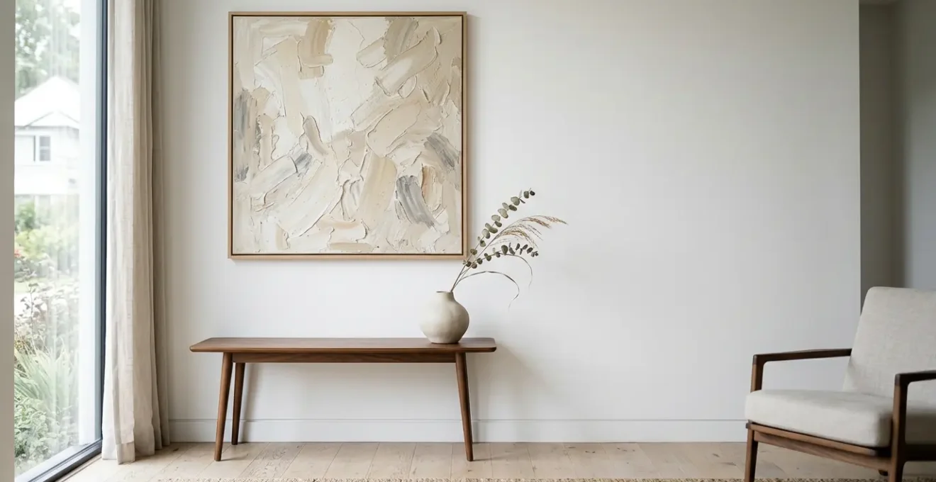
One Large Canvas or 10 Small Frames: Which Expands a Small Room?
When decorating a smaller room, the conventional wisdom to “think small” is often counterproductive. A wall scattered with ten small frames creates what designers call visual noise. The eye is forced to jump from piece to piece, and the multiple frames, edges, and gaps between them break up the wall, making the space feel cluttered and even smaller. The solution, paradoxically, is to go big. A single, large-scale canvas creates a singular, confident focal point.
This approach gives the eye a place to rest, reducing mental clutter and allowing the wall to feel more expansive. An oversized piece, particularly one with significant negative space or a calm, minimalist composition, draws the viewer in and makes the wall itself seem to recede. Research into interior psychology supports this, suggesting that a large artwork, especially with light colors, can increase the perceived size of a room. This effect is powerful; some studies suggest that realistic nature scenes, for example, can create a sense of openness.
Case Study: The Impact of Scale in a 12-Square-Metre Room
A master framer’s comparative study demonstrated that in a standard 12-square-metre room, a single oversized print measuring 90cm by 60cm feels more intentional and expansive than five 20cm frames scattered across the same wall. The large canvas creates a singular focal point and reduces visual ‘noise’ that often makes small rooms feel cluttered. The uninterrupted plane of a large minimalist canvas with negative space gives the eye a place to rest, making walls feel more distant than they actually are. In fact, research into interior psychology suggests that large, light-colored art can increase the feeling of space by up to 22% in some contexts.
Choosing one large canvas is a declaration of intent. It replaces the hesitant chatter of many small frames with a single, clear statement, lending the room an air of sophistication and curated calm. This singular focus helps to expand the room visually, making it a far more effective strategy for small spaces.
The Lighting Mistake That Flattens Your Impasto Paintings
You’ve invested in a beautiful impasto painting, celebrated for its thick, sculptural texture. You hang it, switch on the overhead ceiling light, and watch in disappointment as all that rich, three-dimensional detail vanishes. This is the single most common lighting mistake: relying on flat, frontal, or overhead ambient light. Such lighting hits the canvas head-on, eliminating the very shadows that define the texture. It effectively turns your sculptural masterpiece back into a flat image.
To make an impasto painting come alive, you must treat light as a sculpting tool. The most effective method is the “Grazing Light” technique. This involves positioning a dedicated, directional light source—like a picture light mounted above the frame or a floor-level uplight—to rake across the painting’s surface at a sharp angle. This low-angle light catches the peaks of the paint and casts dramatic, elongated shadows in the valleys, revealing every nuance of the artist’s palette knife or brushwork. The painting is no longer just illuminated; it is carved out of the darkness by the light.
The color temperature of the light is also critical. A warm-toned light (around 2700K-3000K) will enhance the richness of oil paints and create soft, inviting shadows. Conversely, a cool, sterile light (4000K+) can wash out texture and make the artwork feel clinical. By combining the grazing light technique with warm illumination and dimming any competing overhead lights, you allow the painting’s inherent sculptural presence to become the star of the show.
How to Choose Frames That Add 3D Depth to Flat Canvases?
A frame is not just a border; it’s a transitional space between the world of the artwork and the reality of your room. The right frame can dramatically enhance an artwork’s perceived depth, turning even a flat canvas into a three-dimensional object. For modern condos with characterless walls, the float frame is an unparalleled tool for creating this effect. Unlike traditional frames that cover the edge of the canvas, a float frame allows the entire artwork to be visible, recessed inside the frame with a gap around the perimeter.
This gap, known as the “shadow gap,” is where the magic happens. As a canvas framing specialist notes, this design creates a crisp shadow line that gives the illusion of the artwork floating. This is a powerful visual trick. The specialist from Float Frame Design Principles explains:
The shadow gap between the canvas edge and the frame creates a crisp shadow line that tricks the eye into seeing the artwork as an object floating in its own space, adding a breathtaking 3D effect and sophisticated flair to your artwork.
– Canvas Framing Specialist, Float Frame Design Principles
The size of this gap and the depth of the frame can be adjusted to create different levels of projection. A “Deep Recess Floater” with a larger gap will make a heavily textured piece appear to jump forward from the wall, enhancing its sculptural presence. Even for flat prints or photographs, a frame with layered matting can create an architectural recess, drawing the viewer’s eye ‘into’ the artwork. The choice of frame material itself can also create perceptual depth; a raw, textured wood frame provides a tactile contrast that makes a smooth, minimalist artwork ‘pop’.
The following table breaks down how different framing features can be used to manufacture depth, transforming your art from a simple image into a compelling physical object on your wall.
| Frame Type | Shadow Gap Size | Depth Illusion | Best For | Visual Effect |
|---|---|---|---|---|
| Traditional Float Frame | 1/8″ to 1/4″ | Moderate floating effect | Standard stretched canvas, oil paintings | Canvas appears suspended, clean gallery-style presentation |
| Deep Recess Floater | 3/8″ to 1″ gap | Dramatic 3D projection | Heavily textured impasto, encaustic art | Artwork projects forward from wall, enhanced sculptural presence |
| Layered Matting Frame | Multiple stepped layers | Architectural depth | Flat prints, photographs | Stepped recess draws viewer’s eye ‘into’ the artwork |
| Contrast Material Frame | Standard contact | Perceptual depth | Smooth minimalist artwork | Textured wood or metal frame makes flat artwork ‘pop’ through material contrast |
Why Is Texture More Important Than Color Match for Modern Art?
In the world of interior design, “color matching” has long been the dominant rule. We are taught to find art that picks up the exact shade of our cushions or curtains. While this creates a coordinated look, it often results in a space that feels flat, predictable, and devoid of sensory richness. For the modern, often minimalist, interiors of new-builds, prioritizing texture over color is a far more powerful strategy for creating depth, warmth, and a genuine connection to the space.
Texture engages more than just our eyes; it engages our sense of touch, even from a distance. A thickly painted impasto canvas has a haptic dimension—we can imagine how it would feel. This quality makes a space feel more human and grounded, counteracting the sterile perfection of modern construction. As textured artist Amanda Dagg describes, it’s about creating a sensory experience:
Texture makes a piece feel alive and hand-touched, countering digital perfection. Thick paint catches light, casting tiny shadows that shift with your perspective, transforming art from a flat image into a sensory experience.
– Amanda Dagg, Textured Artist, The Magic of Impasto Painting
This sensory engagement has a profound psychological impact. It connects to our innate need for biophilic design—the integration of natural elements and patterns into our built environments. Textures found in art, like the roughness of a linen canvas or the layered strokes of paint, mimic the complex surfaces found in nature. This connection is not merely aesthetic. Research suggests that incorporating these elements can have tangible benefits; for instance, studies show that realistic nature scenes can reduce the feeling of confinement by up to 15% in small office spaces. By focusing on a rich textural dialogue, you create a room that doesn’t just look good, but feels deeply, primally comforting.
How to Layer Textures to Avoid the “Boring Beige” Trap?
A monochromatic room, especially in a neutral like beige or grey, runs the risk of feeling flat and uninspired—the dreaded “boring beige” trap. The secret to creating a sophisticated, high-end monochromatic space lies in aggressive and intentional texture layering. When you remove color as the primary variable, texture becomes the main storyteller, creating depth and interest through the way different surfaces catch and reflect light.
To do this effectively, think in terms of a “Textural Scale.” This framework involves layering textures at three distinct levels to build a rich, tactile environment. It starts with the largest surfaces and works its way down to the smallest details, ensuring that there is visual interest at every distance. This approach prevents the room from feeling one-note and instead creates a complex, harmonious whole that is anything but boring.
Another crucial element is varying the sheen levels within your single color. A room where everything is matte will feel just as flat as one with no texture at all. By strategically mixing finishes—from a dead-flat limewash wall to an eggshell finish on a canvas, to a satin-finished frame and a single high-gloss ceramic or metallic accent—you create subtle shifts in light reflection that provide depth and prevent the color from feeling monotonous.
Your Action Plan: The Textural Scale Framework
- Macro Level – Large Surface Texture: Start with your largest surfaces. Introduce architectural wall treatments like limewash, Venetian plaster, or board-and-batten moulding painted the same color as the walls to create depth through light and shadow.
- Meso Level – Main Object Texture: Select primary furniture and art with substantial tactile quality. A bouclé sofa, a heavily impastoed painting, or a grasscloth wallcovering can serve as the middle-scale textural anchor that draws the eye.
- Micro Level – Detail Texture: Layer in small-scale textural accents for close-up visual interest. Think fringed cushions, rough ceramic vessels, woven baskets, or even paint additives that create a suede-like effect.
- Sheen Variation Strategy: Within your monochromatic palette, consciously vary finishes. Combine matte walls with eggshell art, satin frames, and a single glossy accent object to create rich depth without adding new colors.
Lime Wash vs Venetian Plaster: Which DIY Finish Is More Forgiving?
Once you embrace texture as the key to depth, the wall itself becomes your primary canvas. For the ambitious DIYer looking to banish flat drywall, limewash and Venetian plaster are two of the most sought-after finishes. Both offer a depth and movement that standard paint cannot replicate, but they are worlds apart in terms of application and, crucially, forgiveness for the novice. For a condo owner seeking to add warmth and character without risking a costly mistake, limewash is the undisputed winner.
Venetian plaster aims for a high-polish, marble-like perfection. This glossy finish is its biggest weakness in a DIY context; it highlights every single flaw, bump, and imperfection in the underlying drywall. The application is a multi-step, skilled process requiring specialized trowels and a burnishing technique that is difficult to master. Repairing a patch is nearly impossible for an amateur to blend seamlessly.
Limewash, on the other hand, is inherently forgiving. Its beauty lies in its imperfection. Applied with a simple block brush, its characteristic cloudy, mottled appearance means that inconsistent brush strokes are not a mistake—they are part of the intended character. Its dead-flat, chalky finish is excellent at absorbing light and hiding drywall seams, previous repairs, and minor bumps. Patching is as simple as applying a diluted new coat, which blends naturally into the existing finish. For a DIYer, this means less stress and a more authentically organic result.
The following comparison makes the choice clear for anyone valuing a low-risk, high-reward project. While Venetian plaster offers a specific kind of luxury, limewash provides an accessible path to rich, tactile walls.
| Characteristic | Lime Wash | Venetian Plaster | Winner for DIY |
|---|---|---|---|
| Application Technique | Simple painterly process with block brush, forgiving brush strokes | Multi-step skilled trowel work with burnishing required | Lime Wash |
| Imperfection Tolerance | Inherent chalky, mottled appearance—inconsistencies are part of intended character | Polished surface highlights underlying wall imperfections | Lime Wash |
| Repair & Maintenance | Easy patching with diluted new coat that blends seamlessly into existing finish | Extremely difficult repair, often requires professional for color matching | Lime Wash |
| Surface Forgiveness | Dead-flat, light-absorbing finish hides drywall seams, bumps, previous repairs | Glossy finish accentuates every wall flaw and irregularity | Lime Wash |
| Tool Complexity | Standard block brush, water dilution—tools most DIYers already own | Specialized trowels, burnishing tools, precise layering technique | Lime Wash |
| Finish Appearance | Soft, matte, organic with natural color variation | High-polish, luxurious, marble-like sheen | Subjective |
Key Takeaways
- Prioritize texture over color to add depth and warmth to flat, modern walls.
- Use a single large artwork to reduce visual clutter and make a room feel more expansive.
- Employ directional “grazing” light to reveal the sculptural qualities of textured art like impasto paintings.
How to Use Tactile Wall Treatments to Add Depth to Monochromatic Rooms?
Moving beyond a simple coat of paint is the final frontier in the battle against flat walls. Tactile wall treatments are the foundation upon which all other textural layers are built. In a monochromatic room, where color variation is absent, these treatments work by creating subtle three-dimensional forms that interact with light, generating a constant, gentle play of light and shadow. This adds a layer of architectural interest and sensory depth that paint alone can never achieve.
One of the most effective and sophisticated strategies is the monochromatic moulding approach. By adding architectural elements like board-and-batten, shiplap, or picture frame moulding and then painting them the exact same color and finish as the wall, you create depth purely through form. The shadows cast by the edges of the moulding define the space and break up the flat plane of the wall without introducing any new color, resulting in a look that is both minimalist and richly detailed.
For a softer, more sensory approach, fabric wallcoverings like grasscloth, linen, or even bouclé can transform a room. These materials add not only visual texture but also a literal softness and sound-absorbing quality, contributing to the room’s overall feeling of comfort and enclosure. However, a critical rule applies: the “Feature Wall vs. Art” balance. A highly tactile wall—whether rough plaster or bold moulding—acts as a piece of art in itself. It must be paired with visually simpler art, like a minimalist canvas or a simple line drawing, to avoid a chaotic competition for attention. Conversely, a highly textured, statement artwork requires a smooth, quiet wall to truly shine.
By embracing these principles—prioritizing texture, sculpting with light, and treating your walls as a canvas—you can begin to transform your space. The next step is to conduct a “texture audit” of your own room and identify the first opportunity to introduce a new layer of tactile depth.