In summary:
- Treat black metal not as decoration, but as a graphic tool to draw lines and define zones within a white space.
- The profile, finish, and shadow of each accent form a “graphic vocabulary” that sculpts the room’s architecture.
- Mastering the use of negative space—the white area between the black lines—is crucial for creating rhythm and avoiding a “caged” feel.
- The goal is not to add black items, but to use black lines to give structure, depth, and a deliberate composition to a minimalist interior.
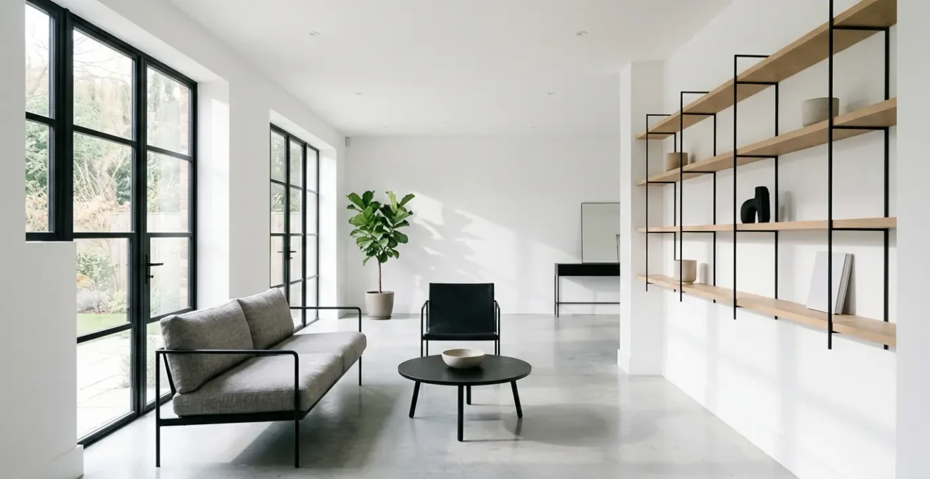
For the minimalist, a white room is a canvas of infinite potential, but also a challenge. Without structure, it can feel undefined, bland, even sterile. The conventional approach is to add color or bulky furniture, but this often betrays the minimalist ethos. You might see advice to simply add black picture frames or a dark rug, but these are isolated solutions, not a cohesive strategy. They are decorative afterthoughts.
The true potential of a white room is unlocked not by decorating it, but by designing it. This requires a fundamental shift in perspective. What if the solution wasn’t about adding objects, but about drawing lines? What if black accents weren’t just ‘things’ but were your ink, used to sketch boundaries, direct the eye, and give graphic structure to the space? This is the graphic designer’s method: treating your three-dimensional room like a two-dimensional composition.
This guide moves beyond simple decoration. We will deconstruct how to wield black metal accents with the precision of a drafting pen. We will analyze how line weight, finish, and even shadow become part of your design toolkit. From the profile of a window frame to the pull on a cabinet, each element is a deliberate mark on the canvas. The result is a space that is not just filled, but architecturally defined, where every line serves a purpose and every void is intentional.
This article provides a structured approach to mastering this technique. The following sections break down the core graphic principles you can apply to transform your white spaces with precision and intent.
Summary: A Graphic Guide to Sculpting Space with Black Accents
- Thick vs Thin Frames: Which Profile Suits Small Windows Best?
- Matte vs Satin Black: Which Finish Resists Limescale in Bathrooms?
- The Overuse Mistake: When Do Black Bars Make a Room Feel Trapped?
- How to Swap Cabinet Hardware for a Graphic Update Under $200?
- Gold vs Chrome: Which Metal Pairs Best With Black Accents?
- Corten vs Stainless Steel: Which Metal Suits a Warm Palette?
- How to Match Large Scale Patterns Without Wasting 50% of the Roll?
- Which Contemporary Paintings Add Depth to Flat Walls Without Cluttering?
Thick vs Thin Frames: Which Profile Suits Small Windows Best?
The line weight of a window frame is the most fundamental graphic decision in a room. For small windows, the instinct might be to use a minimal frame to maximize light, and this is often correct. A thin, black metal frame acts as a fine, crisp line, elegantly outlining the view without overwhelming it. It says, “The view is the art; I am merely the frame.” This approach aligns with modern architectural styles that prioritize an uninterrupted connection with the outdoors. Advanced materials have made this possible; modern aluminum frames can be as slim as 70mm to 85mm, significantly increasing the glass-to-frame ratio.
However, the counter-argument is also powerful. A thicker, more pronounced black frame on a small window turns the window itself into a piece of art. It creates a bold, deliberate statement, transforming a simple opening into a strong focal point. This is less about maximizing the view and more about using the window as a graphic element within the wall’s composition. In a minimalist white room, a series of small windows with thick black frames can create a powerful rhythm and a grid-like structure that is highly intentional. The choice is not about right or wrong; it’s about defining your intent. Do you want the frame to disappear or to become a dominant line in your composition?
Ultimately, for small windows, a thin profile is the safer, more classic choice for enhancing light and space. But if your goal is a bold, graphic statement, a thick profile should not be dismissed. It’s a choice between a whisper and a declaration. As seen in many high-end contemporary buildings, slim profiles are used to enhance a sleek, modern aesthetic, maximizing light and view as a key design feature.
Matte vs Satin Black: Which Finish Resists Limescale in Bathrooms?
In the high-humidity environment of a bathroom, the finish of your black metal accents is not just an aesthetic choice—it’s a functional one. The battle against water spots and limescale is fought at the micro-level of surface texture and light reflection. Matte and satin finishes offer distinct graphic and practical properties. A matte black finish is the purist’s choice for graphic impact. It absorbs light, creating the illusion of a void—a pure, non-reflective line or shape. This is because it has a very low gloss level. However, its slightly porous texture can make it susceptible to holding onto mineral deposits from hard water.
A satin black finish, by contrast, has a subtle sheen. It’s a compromise between matte and semi-gloss, designed to offer a soft luster. While it doesn’t have the stark, absolute quality of matte, this slight reflectivity is its secret weapon. According to industry measurements, satin finishes have 25-35% gloss compared to matte’s 5-10%. This smoother, less porous surface makes it physically easier to wipe clean. More importantly, its gentle sheen helps to camouflage water spots and fingerprints by diffusing light across the surface, rather than highlighting every imperfection with a stark contrast.
So, which is better for a bathroom? For pure, uncompromising graphic design where cleaning is meticulous, matte black delivers the strongest statement. It is a commitment. For most real-world applications where practicality is paramount, satin black is the superior choice. It offers 90% of the graphic impact with significantly more resilience against the daily realities of limescale and water marks. It provides a durable elegance that doesn’t demand constant vigilance.
The Overuse Mistake: When Do Black Bars Make a Room Feel Trapped?
There is a fine line between a room feeling graphically defined and feeling trapped. Black metal accents, when used correctly, create structure and rhythm. When overused, they create a cage. This mistake typically happens when the designer forgets the most important element in a black-and-white scheme: the white. The negative space is not a background; it is an active part of the composition. As Gonzalo Bueno of Ten Plus Three design studio notes, black accents are about adding drama and depth, not about filling every void. He states, “My favorite way to use them is where I want to enhance furniture, art or accessories.” The goal is enhancement, not imprisonment.
The “trapped” feeling arises from a lack of visual hierarchy and rhythm. It’s what happens when too many black lines of equal visual weight compete for attention, creating visual noise instead of a clear path for the eye. Imagine a room with black window frames, black shelving units, a black-legged table, and black chair legs all crammed together. The eye doesn’t know where to rest, and the intersecting lines form a chaotic grid that feels constricting. The room loses its sense of airiness and becomes a collection of barriers. The key is to create rhythm through repetition and spacing, not to create a dense, impenetrable web.
To avoid this, you must think like a composer. A composition needs pauses. Allow for large expanses of uninterrupted white wall. Let one strong black element—like a Crittall-style room divider—be the hero, and let other black accents be quieter, supporting notes. Vary the “line weight” of your accents; a thick, bold table base can be balanced by the delicate, thin lines of chair legs. Balance is not about an equal amount of black and white, but about a harmonious relationship between them.
Action Plan: Visual Balance Test
- Dominance Choice: Start by choosing one color to dominate the space. In a white room, white should occupy at least 60-70% of the visual real estate.
- Neutral Buffers: Balance the two colors by placing neutral tones (like light wood, soft grays, or natural textiles) between strong black elements to soften the contrast.
- Visual Breaks: Add small metallic or colorful accents (a brass vase, a single green plant) to create deliberate visual breaks and prevent a monotonous, “trapped” feeling.
- Negative Space Audit: Step back and ensure there is adequate negative (white) space between your black elements. The space between the lines should feel as intentional as the lines themselves.
How to Swap Cabinet Hardware for a Graphic Update Under $200?
Swapping cabinet hardware is one of the most cost-effective yet transformative updates you can make, especially in a minimalist white kitchen or bathroom. It’s an opportunity to inject a precise graphic language onto a blank plane. This isn’t just about replacing handles; it’s about choosing your points, lines, and shadows. For a budget under $200, the impact is unparalleled. In fact, some design experts note that for budget-conscious homeowners, a simple $60 set of matte black pulls can completely redefine a kitchen’s aesthetic.
The first step is to see your cabinets as a grid. Your hardware choices will determine the rhythm of this grid. Do you want a series of strong vertical or horizontal lines? Choose long, black T-bar pulls. Do you prefer a scattering of punctuation marks? Opt for small, round black knobs. Each choice has a different graphic weight and direction. T-bar pulls create vectors that lead the eye, while knobs create points that anchor the composition. Don’t be afraid to mix them: use pulls for drawers and knobs for cupboards to create a subtle hierarchy.
Most importantly, consider the shadow. A crucial concept from my “Lexicon of Originality” is the idea of shadow-casting properties. Under kitchen lighting, every piece of hardware will cast a shadow. A flat-bar pull will cast a long, sharp, linear shadow. A cup pull will create a soft, crescent-shaped shadow. These shadows are secondary graphic elements that add depth and complexity to the cabinet faces. When selecting your hardware, think about the lines it will create both in its physical form and in the shadow it casts. This small detail is what separates a simple update from a sophisticated graphic statement.
Gold vs Chrome: Which Metal Pairs Best With Black Accents?
Once you’ve established black metal as your primary graphic anchor, the choice of a secondary metal is about defining the ‘temperature’ and mood of your design. It’s the difference between sharp, cool modernism and warm, inviting luxury. Black provides the structure; the secondary metal provides the personality. There is no single “best” partner, only the best partner for your intended aesthetic. As the design studio Victorious Interiors points out in their guide, the combination of “Brass and Black: Timeless and dramatic, this pairing works beautifully in both kitchens and bathrooms.” This highlights the power of a warm metal to add a layer of classic sophistication to the starkness of black.
Pairing black with gold or brass introduces warmth and a touch of glamour. This combination has Art Deco and mid-century roots, creating a sense of established luxury. The warm, reflective quality of brass softens the severity of the black lines, making the space feel more inviting and less austere. It’s a choice that says “sophisticated and confident.” In contrast, pairing black with chrome or polished nickel creates a cool, sleek, and contemporary feel. This pairing is clean, sharp, and almost futuristic. The cool, blue undertones of chrome amplify the graphic nature of the black, resulting in a high-contrast, high-impact look that feels very clean and precise. It’s a choice that says “modern and efficient.”
The key to success is maintaining a clear hierarchy. Black should remain the dominant accent, with the secondary metal used more sparingly as a highlight—on a faucet, a light fixture, or the legs of a small table. This prevents the two metals from competing and creating visual clutter. The following table provides a clear guide for these pairings.
| Metal Pairing | Mood Created | Best For | Recommended Ratio |
|---|---|---|---|
| Black + Brass/Gold | Warm, luxe, Art Deco | Traditional, transitional spaces | 80% Black, 20% Brass |
| Black + Chrome/Nickel | Cool, sleek, contemporary | Modern, minimalist interiors | 80% Black, 20% Chrome |
| Black + Copper | Industrial, warm-rustic | Industrial, farmhouse styles | 70% Black, 30% Copper |
| Black + Matte Black (mixed sheens) | Sophisticated, tonal | Monochromatic modern spaces | Variable mix |
Corten vs Stainless Steel: Which Metal Suits a Warm Palette?
When your white room isn’t a pure, sterile white but is softened by a warm palette—think off-whites, creams, and natural woods—the choice of an accompanying metal becomes even more critical. Here, your black accents provide the graphic punch, but a third element is needed to bridge the temperature gap. The debate between a metal like Corten steel and stainless steel is a perfect illustration of this principle. As explained by experts at Rocky Mountain Hardware, warm metals like brass and bronze bring richness, while cool metals like stainless steel add sleekness.
In a warm palette, stainless steel can be a jarring choice. Its cool, bluish-grey hue creates a high-contrast, almost clinical feel against warm woods and creamy whites. While this can be a deliberate and effective choice for a stark, industrial look, it often fights against the inviting nature of a warm palette. It creates a third, disconnected point in the visual triangle between the warm walls, the neutral black, and the cool steel.
This is where a metal like Corten steel (or other warm metals like bronze or copper) excels. Corten, with its stable, rust-like finish, has a deep, earthy warmth. Its palette of oranges, reds, and browns acts as a perfect intermediary. It harmonizes with the warm tones of the wood and walls while also having the visual weight and industrial heritage to stand alongside black steel. It doesn’t fight for attention; it completes the chord. Imagine a kitchen with cream cabinets, a black metal island frame, and a Corten steel range hood or backsplash. The Corten becomes a beautiful, textured focal point that ties the entire warm-and-cool scheme together. It allows the black lines to retain their graphic power without making the space feel cold.
How to Match Large Scale Patterns Without Wasting 50% of the Roll?
While black metal accents provide the ‘lines’ for your graphic composition, large-scale black and white patterns can provide the ‘texture fill’ or ‘solid planes’. They are an excellent way to define a zone, such as an entryway or the wall behind a headboard, with a single, bold gesture. As HGTV Magazine notes, “Graphic patterns will floor your guests in the best way possible.” However, the fear of pattern matching, especially with large repeats, leads to significant waste, often deterring people from this powerful tool. The key is to shift your mindset from ‘avoiding waste’ to ‘repurposing remnants’.
The traditional method of matching large patterns involves ordering 15-20% extra wallpaper to account for the pattern repeat, and often, much of that ‘extra’ is discarded as off-cuts. A more strategic, zero-waste approach involves planning for the use of these remnants from the very beginning. Instead of seeing off-cuts as waste, see them as a source of free, matching graphic material. This is where the graphic definition extends beyond the single accent wall and creates a cohesive rhythm throughout the space.
The ‘waste’ from your main wall can be used to create a series of powerful, connected accents. This technique transforms a potential problem into a design opportunity, creating a layered, professional look with maximum impact and minimum waste.
Case Study: The Wallpaper Waste Transformation Strategy
Interior designers have pioneered a strategy that uses large-scale black and white patterned wallpaper as a direct alternative to metal bars for zone definition. Instead of discarding the inevitable off-cuts from pattern matching, they are repurposed with intent. Remnants are used to line the back of bookshelves, creating a surprising pop of pattern. Smaller pieces are meticulously cut and placed into a triptych of simple black frames, creating custom artwork that perfectly matches the accent wall. This approach, as highlighted by design blogs like Havenly, not only eliminates waste but also repeats the core graphic element throughout the space, achieving the same rhythmic effect as carefully placed metal accents but with a softer, more textured feel.
Key takeaways
- Think like a graphic designer: Use black metal as ‘ink’ to draw lines and sculpt space, not just as decoration.
- Master the details: The finish (matte vs. satin) and profile (thick vs. thin) of your accents determine their graphic weight and function.
- Leverage negative space: The white space between black accents is an active design element. Use it to create rhythm and prevent a ‘caged’ look.
Which Contemporary Paintings Add Depth to Flat Walls Without Cluttering?
Art is the final and most personal layer of graphic definition. On a flat white wall, the right artwork can create immense depth, but the wrong choice can introduce clutter and visual chaos. In a minimalist, black-and-white scheme, the power often lies not in the artwork itself, but in its framing and placement. As noted by SUKKHA Interior Design, “Art can be a powerful tool in creating depth… Black and white photographs, paintings, or prints can add a focal point and draw the eye.” The secret is to use art as a strategic compositional element.
Forget a single, large, colorful painting. Instead, embrace the power of the triptych or series. Select a series of three or five smaller, related works (abstract black and white prints, simple line drawings, or black and white photographs) and mount them in identical, simple black gallery frames. This strategy shifts the focus from “what is the art?” to “how is the art arranged?” It’s a masterclass in using rhythm, repetition, and—most importantly—negative space.
The space *between* the frames becomes as important as the frames themselves. By maintaining a consistent, deliberate gap between each piece, you create a calm, measured rhythm that defines a zone on the wall. This group of frames acts as a single, large-scale graphic element, providing a focal point and a sense of order without the clutter of a gallery wall. The black frames act as the final set of lines in your room’s composition, reinforcing the graphic language established by your window frames, hardware, and furniture legs. The artwork within the frames adds personality, but the frames and their spacing provide the architectural structure.
You now possess the core principles of using black accents not as mere objects, but as a powerful graphic language. Stop decorating; start designing. Take these concepts, pick up your metaphorical ‘pen,’ and begin to draw the clean, structured, and intentional space you envision.