In summary:
- Treat your wall as a high-quality canvas; proper preparation is essential for a convincing illusion.
- Hand-painted murals offer unparalleled texture and seamlessness that vinyl cannot replicate, crucial for high-end optical effects.
- Eliminate “color breaks” by wrapping murals around corners to trick the brain into perceiving a larger, continuous space.
- Use strategic lighting (wall washing with high CRI) to enhance the mural’s depth and prevent hotspots that reveal the flat surface.
- In very small spaces like powder rooms, use bold, immersive murals to create a “jewel box” effect that distracts from the room’s actual dimensions.
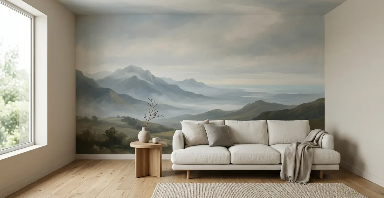
Living in a small space can often feel like being confined within a box, with walls that seem to close in. The conventional wisdom for creating an illusion of space involves light paint colors, strategic mirrors, and minimalist furniture. While these methods have their merits, they often only scratch the surface of what’s possible. They treat the wall as a boundary to be endured, a limit to be camouflaged. But what if the wall itself wasn’t a limit, but a canvas for profound transformation?
The true art of spatial expansion lies not in decorating a surface, but in an act of architectural deception. This is where the interior mural transcends simple decoration and becomes a powerful tool of illusion. The secret isn’t just the image you choose, but a holistic approach that methodically dismantles the brain’s perception of physical boundaries. It’s about convincing the eye, and therefore the mind, that the wall is not a barrier, but a portal to a space beyond.
This guide will walk you through the trompe-l’œil artist’s process for achieving this illusion. We will explore how to prepare your canvas for a flawless finish, choose the right medium for maximum impact, and master the technical and psychological principles that turn a flat surface into a window of infinite depth. By understanding these elements, you can transform any small room from a confine into an experience.
To guide you through this artistic journey, this article breaks down the essential steps and considerations for creating a successful spatial illusion. The following sections will provide a detailed roadmap, from technical preparation to the psychology of perception.
Summary: How to Use Interior Murals to Alter Depth Perception in Small Rooms?
- Smooth vs Textured: How to Prep a Wall for a Hand-Painted Mural?
- Vinyl Decal vs Hand-Painted: Which Looks High-End on Close Inspection?
- The “Taste Specific” Risk: Will a Mural Make Your House Harder to Sell?
- Wall Washing: How to Light a Mural evenly Without Hotspots?
- How to Scale an Image Up to a Wall Without Losing Resolution?
- How to Match Large Scale Patterns Without Wasting 50% of the Roll?
- Why Does Eliminating Color Breaks Trick the Brain?
- How to Apply Bold Wallpaper in Small Powder Rooms for Maximum Impact?
Smooth vs Textured: How to Prep a Wall for a Hand-Painted Mural?
Before a single brushstroke is applied, an artist must first respect their canvas. In mural painting, the wall is your canvas, and its condition is the foundation of the entire illusion. A flawless, deep perspective can be instantly shattered by a poorly prepared surface. Bumps, cracks, or aggressive textures will catch the light and constantly remind the viewer’s brain that they are looking at a flat, imperfect wall, not gazing into a distant landscape. The goal is to make the wall plane disappear, and that begins with achieving the right surface quality.
A perfectly smooth wall is the ideal. For hyper-realistic trompe-l’œil or high-gloss finishes that create a watery, reflective depth, a Level 5 drywall finish is non-negotiable. This involves applying a skim coat over the entire surface to create a plane as smooth as glass. However, many residential walls have a light “orange peel” texture. This can be acceptable for more forgiving mural styles, like abstract landscapes or painterly scenes, as the light texture can sometimes add a ‘forgiveness factor’ for minor imperfections. The key is to run your hand across the wall under a low, raking light to feel for and see any irregularities that might break the spell.
Heavier textures, such as popcorn or knockdown, are the enemies of a convincing mural. They create harsh shadows and visual noise that compete with the artwork. These surfaces must be smoothed. This can be achieved by scraping and sanding on unpainted drywall, but more often, it requires applying a skim coat of joint compound. This process transforms a coarse surface into a pristine canvas, ensuring that the only texture visible is the one the artist intentionally creates with paint.
Action Plan: Verifying Your Wall’s Readiness
- Surface Assessment: Run your hand across the wall. Use a flashlight at a low, raking angle to reveal bumps, dips, and texture. Are there any imperfections that will catch the light and break the illusion?
- Finish Level Identification: Determine your wall’s current drywall finish. Is it a Level 3 (basic, suitable for heavy texture), a Level 4 (standard paint-ready), or a Level 5 (perfectly smooth skim coat)?
- Texture Compatibility: For painted murals, a light ‘orange peel’ may be acceptable. For hyper-realism, high gloss, or vinyl murals, a Level 5 finish is required. Heavier textures must be smoothed.
- Correction Plan: If the texture is too rough, decide on the method: scrape-and-sand for unpainted popcorn texture, or apply one or more skim coats of joint compound for a truly smooth, professional-grade surface.
- Final Sealing: Once smooth and sanded, apply a quality sealer like Zinsser Gardz. This creates a uniform, non-porous surface that ensures even paint absorption and perfect adhesion for your future artwork.
Vinyl Decal vs Hand-Painted: Which Looks High-End on Close Inspection?
Once the canvas is prepared, the artist must choose their medium. In the world of murals, this often comes down to a choice between a hand-painted creation and a printed vinyl decal. While both can depict a similar image from a distance, the difference upon close inspection is the difference between an original masterpiece and a high-quality print. For the purpose of creating a truly convincing and high-end illusion of depth, the tactile qualities of a hand-painted mural are almost always superior.
The magic of a hand-painted mural lies in its texture and life. As an artist, I can layer paints, vary the sheen from matte to satin to create atmospheric effects, and leave the subtle ridges of brushstrokes. These micro-textures catch the light in an organic way, adding a layer of authenticity that a flat vinyl print cannot replicate. This tactile quality tricks the brain into perceiving real depth and form. A printed mural, by contrast, has a uniform sheen and digitally replicated textures that appear flat under scrutiny, which can undermine the illusion of a three-dimensional space.
As the experts at Art Etc Team highlight, the physical act of painting introduces a richness that digital methods struggle to match. This human touch is what separates decoration from art.
Paint allows artists to create subtle textures, brush strokes, and layering effects that vinyl printing cannot replicate. This adds depth and richness to the artwork, making it more engaging.
– Art Etc Team, The Cost Efficiency and Visual Appeal of Painting Large-scale Murals vs Vinyl Applications
Seamlessness is another critical factor. A hand-painted mural is one continuous piece of art, perfectly integrated into the wall. A large vinyl mural, however, will inevitably have seams between panels. These fine lines, along with the potential for peeling edges or air bubbles over time, are visual interruptions that can instantly break the immersive spell you are trying to cast. The following table breaks down these critical differences in quality.
| Quality Factor | Hand-Painted Murals | Vinyl Decals |
|---|---|---|
| Texture & Depth | Authentic brushstrokes, variable sheen (matte background + satin details possible), layering creates micro-texture | Flat surface, uniform sheen, digitally replicated brushstrokes lack tactile authenticity |
| Seamlessness | No seams, soft-edge blending, fully integrated into wall | Visible seams on large installations, potential for air bubbles, peeling edges |
| Color Longevity (UV) | High-quality paints maintain vibrancy for years to decades with proper maintenance | Prone to fading under sunlight/harsh lighting, especially lower-quality vinyls |
| Repairability | Seamless touch-ups possible, can be repainted or restored | Damaged sections require full panel replacement, visible patch lines |
| Long-term Value | Can last decades, ages with character, increases with artist reputation | Typically 3-7 year lifespan, peeling/bubbling common in high-traffic or outdoor areas |
The “Taste Specific” Risk: Will a Mural Make Your House Harder to Sell?
Committing to a full-wall mural is a bold artistic statement, which naturally raises a practical question for homeowners: will this deeply personal choice become a liability when it’s time to sell? The fear is that a “taste specific” feature will deter potential buyers who don’t share your aesthetic vision. This is a valid concern, but one that can be managed by approaching the mural not as a simple decoration, but as a piece of integrated architectural art.
The key to mitigating resale risk lies in the mural’s subject matter and execution. A mural depicting a highly personal theme—such as a family portrait, a niche hobby, or an obscure reference—is indeed likely to narrow your pool of buyers. However, a well-executed mural with a more universal and timeless theme can transform from a risk into a significant selling feature. Think of atmospheric landscapes, sophisticated abstract compositions, or subtle, textured patterns. These function less like a loud statement and more like a bespoke finish, akin to custom cabinetry or unique stonework.
Instead of seeing a quirky personalization, a potential buyer sees a home with character and a built-in piece of art that creates a memorable, high-value experience. The mural can become the “wow factor” that makes your property stand out in a crowded market. The trick is to choose a design that enhances the space’s architecture rather than overpowering it. A mural that successfully makes a small room feel larger is demonstrating a tangible benefit, a solution to a common problem, which has inherent value to any future owner.
Ultimately, a mural is an investment in your own enjoyment of the space. If it brings you joy and transforms your living experience, it has already provided a return. By choosing a sophisticated and broadly appealing subject, you position that investment not as a future cost (of removal and repainting) but as a unique asset that adds unquantifiable character and distinction to your home. It’s about framing the conversation away from “Do I like this picture?” to “Have I ever seen a space that feels like this?”
Wall Washing: How to Light a Mural evenly Without Hotspots?
An illusion is only as good as its lighting. You can have the most masterfully painted mural, but if it’s lit poorly, the magic vanishes. Harsh overhead lights create “hotspots”—bright, glaring circles—that flatten the image and scream “this is a wall!” They create uneven shadows that distort proportions and destroy the carefully crafted illusion of depth. As an artist, I consider light the final, crucial brushstroke. The goal is not just to illuminate the art, but to sculpt the perception of it, ensuring the illusion holds from every angle.
The most effective technique for this is called wall washing. This involves placing recessed ceiling lights a specific distance from the wall (typically 2.5 to 3 feet) so their beams overlap and create a smooth, even sheet of light that “washes” down the entire vertical surface. This uniform illumination eliminates hotspots and harsh shadows, allowing the mural’s colors and depth to be perceived as intended. A more dramatic alternative is “wall grazing,” where lights are placed very close to the wall to emphasize texture. This is a strategic choice for a mural on a brick or stone surface, but for an illusion of depth on a smooth wall, it’s counterproductive.
Two technical factors are critical for success. The first is the Color Rendering Index (CRI) of the bulbs. To ensure the colors of your mural appear true and vibrant, you must use lights with a high CRI of 90 or more. Lower CRI lights can make colors look dull or shifted, flattening the perceived depth. Professional lighting specialists confirm that for displaying art, a CRI of 90 or higher is the minimum standard. The second factor is color temperature. Cool light (around 4000K) can make a landscape mural feel more vast and airy, enhancing the illusion of distance. Warm light (around 2700K) creates a sense of intimacy, which can sometimes work against the goal of making a space feel larger.
Modern solutions like linear LED profiles hidden in ceiling coves or adjustable pinhole downlights offer even more precise control. They allow you to perfectly aim the light, ensuring the entire artistic illusion is revealed and the physical wall remains hidden in plain sight.
How to Scale an Image Up to a Wall Without Losing Resolution?
The artist’s challenge often begins with a small sketch or a digital image, a mere seed of an idea. The technical hurdle is to grow that seed to the grand scale of a wall without it devolving into a blurry, pixelated mess. Losing resolution during scaling is the fastest way to shatter the illusion of reality you’re trying to create. A crisp, clear image invites the viewer in; a fuzzy one pushes them away and exposes the artifice.
The first decision point is the nature of the image itself. If the mural is composed of geometric shapes, lines, or graphic illustrations, using a vector format (like an SVG or AI file) is the ideal solution. Vector graphics are based on mathematical equations, not pixels, meaning they can be scaled infinitely without any loss of quality. For murals based on photographs or complex, painterly textures, you’ll be working with raster images (like JPG or PNG), which are made of a finite number of pixels. This is where resolution becomes critical.
For a crisp mural, the source image must have a high resolution relative to the final size. A common rule of thumb is to aim for a minimum of 150-200 DPI (dots per inch) at the final print size. For example, a standard 72 DPI web image will look disastrous when blown up to wall size. To create an 8×10 foot mural, you would need an image file of staggering proportions—well over 200 megapixels. Sourcing a photo with such high native resolution is difficult, which is where AI comes in. Modern software like Topaz Gigapixel AI can intelligently upscale images, using machine learning to reconstruct detail and transform a good-quality photo into a mural-ready file, a technique supported by modern digital art practices.
For the traditional artist, the time-honored solution is the grid method. This low-tech, high-skill approach involves drawing a proportional grid over the small reference image and a corresponding larger grid on the wall. The artist then meticulously transfers the contents of each small square to its large counterpart on the wall, ensuring perfect proportions and composition without ever needing a projector or a massive digital file. It’s a purely analog technique that guarantees the artist’s vision is scaled with precision and human touch.
How to Match Large Scale Patterns Without Wasting 50% of the Roll?
When working with repeating wallpaper patterns rather than a custom-printed mural, a new challenge emerges: pattern matching. This is especially true for large-scale patterns, which are often chosen for their bold, space-altering impact. The issue is that to align the pattern from one strip to the next, a significant portion of the roll is often cut away and discarded. This is particularly prevalent with “drop match” patterns, where the design is staggered horizontally, forcing you to waste material to find the alignment point.
The first step in minimizing waste is understanding the pattern you’re working with. A “straight match” aligns horizontally across strips, leading to less waste. A “random match” requires no alignment and produces minimal waste. The “drop match” is the most wasteful but often the most dynamic. To calculate your needs accurately for a drop match, you must add the full height of the pattern repeat to the length of each strip you cut. Forgetting this step is a common and costly mistake.
A strategic application method can also help. Instead of starting in a corner, begin hanging the wallpaper in the center of the most prominent wall. This places the most complete and visually impactful part of the pattern in the room’s focal point. As you work your way outwards, the partial, cut-off patterns are pushed into the corners, where they are less noticeable. This doesn’t reduce the total amount of waste, but it maximizes the visual impact of the material you do use.
To reduce the “psychological cost” of waste, get creative with the offcuts. Large, unavoidable scrap pieces can be repurposed beautifully. Use them to line the back of a bookshelf, cover switch plates for a seamless look, or even frame them as smaller, complementary art pieces to hang elsewhere in the home. However, the ultimate solution to this problem is to bypass repeating rolls entirely. A custom-printed mural, created to the exact dimensions of your wall, is a zero-waste alternative. It arrives as a single, seamless image or in panels designed for perfect alignment, completely eliminating the issue of pattern repeat waste and ensuring a flawless, uninterrupted illusion.
Why Does Eliminating Color Breaks Trick the Brain?
Here we arrive at the very heart of the illusion: the psychology of spatial perception. Making a room feel larger is not about the picture on the wall, but about systematically removing the visual cues that tell our brain where the room ends. The most powerful of these cues are “breaks”—the corners, trims, and edges where one surface stops and another begins. By eliminating these breaks with a continuous mural, we exploit a fundamental principle of our own perception.
This technique leverages the Gestalt principle of continuity. Our brains are hardwired to see continuous, uninterrupted forms and follow lines and shapes beyond their ending points. A mural that flows seamlessly from one wall, around a corner, and onto the next forces the brain to perceive the two walls as a single, larger entity. The physical corner is still there, but the visual cue has been erased. The brain, seeking the simplest interpretation, favors the illusion of a continuous surface over the reality of a corner. As noted in research on visual perception in design, this preference for continuity is a powerful tool for illusionists.
The brain prefers to see continuous, uninterrupted forms. A mural that flows across a whole wall, without the ‘break’ of a corner or trim, forces the brain to perceive the surface as a single, larger entity.
– Visual Perception Research, Visual Depth in Small Room Design: Tips for Maximizing Space
Another powerful technique in this vein is applying atmospheric perspective. This is an artist’s trick to create depth on a flat canvas by mimicking how we see things in the real world: distant objects appear lighter, less detailed, and bluer. A mural depicting a misty mountain range or a fading horizon uses this principle to trick the brain into interpreting the wall not as a nearby surface, but as a distant view. The boundary of the room effectively dissolves into the mist.
For the ultimate act of architectural deception, you can extend the mural onto the “fifth wall”: the ceiling. A mural of a sky, complete with clouds, that continues from the top of the walls onto the ceiling completely eradicates the upper boundary of the room. It creates a powerful illusion of height and openness, transforming a confining box into an open-air space. By wrapping a mural around all four walls and onto the ceiling, you create a 360-degree immersive environment where the room’s physical constraints entirely dissolve.
Key takeaways
- A mural’s success as an optical illusion begins with a perfectly smooth (Level 5) wall surface; texture is the enemy of deception.
- Hand-painted murals provide authentic texture and seamlessness, qualities that are essential for a convincing, high-end illusion of depth.
- The greatest trick is boundary dissolution: wrapping a mural around corners and onto the ceiling erases the visual cues that define a room’s small size.
How to Apply Bold Wallpaper in Small Powder Rooms for Maximum Impact?
Now, let’s apply these principles to the ultimate challenge: the small powder room. Conventional design logic would dictate using light colors and minimal pattern to avoid overwhelming such a tiny space. But as an illusionist, I say the opposite is true. Fighting against the smallness is a losing battle. The most powerful act of spatial deception here is to embrace it, transforming the room into an intentional, immersive “jewel box” experience.
This is where bold, large-scale wallpaper or murals shine. By covering all walls in a dramatic, engaging pattern, you create a destination. The room is no longer just “small”; it’s a precious, surprising, and intricate space. Counterintuitively, dark and moody wallpapers can be exceptionally effective. Dark colors and complex patterns can create spatial ambiguity by blurring the corners and edges of the room. When the brain can’t easily discern the exact dimensions, the space feels more mysterious and boundless, not just cramped.
In a powder room, the ceiling is a prime, unexpected surface. Applying a bold wallpaper to this “fifth wall” is a masterstroke. It draws the eye dramatically upward, creating a sense of volume and grandeur that completely distracts from the room’s small footprint. A dark, starry night sky or a lush, trailing floral pattern on the ceiling can make the room feel infinitely tall. Pairing this bold treatment with an oversized or uniquely shaped mirror is another key strategy. The mirror doesn’t just reflect light; it multiplies the pattern, creating a kaleidoscopic, dynamic effect that makes the space feel complex, layered, and anything but simple and small.
The goal is to shift the occupant’s perception from the room’s physical limitations to the richness of the sensory experience. A 360-degree mural treatment, wrapping continuously around all walls, creates a seamless, transportive environment. The liability of small size is transformed into an asset of intimate immersion. The powder room ceases to be a functional afterthought and becomes a memorable, deliberate artistic statement.
By viewing your walls not as barriers but as canvases, you unlock the potential to reshape your environment. The art of trompe-l’œil is a powerful tool to transform the perceived reality of a space, proving that the experience of a room is limited not by its physical dimensions, but by the boundaries of your imagination.